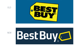
Last August, Best Buy opened a new 45,000 square foot store in the Mall of America. Along with the introduction of the store to the largest mall in North America, and a rockin’ performance by NKOTB (that’s New Kids on the Block for those of you who came of age in the mid-80’s), Best Buy unveiled a more modern and upscale logo. Crisp, clean, and refreshing, the new logo is sure to become as immediately recognizable as its predecessor. This is not to say that it is without flaws, but overall, this is a very nice re-brand for such an iconic store.
The old logo, in use since 1989, consisted of a giant yellow tag, like those found on clearance, sale, or bargain-priced items. This suggested to shoppers that they were going to get the lowest price and best possible deal on their electronics purchase, and became an icon of the brand itself…it is used to show pricing information throughout the store, as a repeating pattern and texture in print ads and commercials, and is instantly recognizable among all other competing electronics superstores.
Set in Futura Extra Bold typeface is the company name, nicely contained inside the shape of the yellow tag. Because the logo is a compact unit, it is highly versatile in applications: on buildings it is enlarged to gargantuan proportions over entrances and can be placed on just about any background color or image (although it almost always appears on blue backgrounds—a nice visual tie-in with employee uniforms, which are blue polo shirts and khakis). The only limiting factor to the old Best Buy logo is how small it can be reduced—if shrunk to business card size or smaller, the bold letterforms would fill in (particularly on the newsprint circulars found in Sunday morning newspapers).
The new logo alleviates some of these reproducibility issues with a slimmer, more modern typeface that now resides to the left of the tag. While removing some of the weight from the logotype was a good thing, too much bulkiness was removed from the yellow tag…it is now too dainty and gets lost as an outline. This is particularly evident when appearing on a white background— simply making the tag all yellow would draw a more immediate connection with the old identity, without diluting the almost twenty years of brand equity that has been established.
While the new logo does address certain reproducibility issues, it creates new problems as well. For example, the new identity is very horizontal. While this may work in most instances and applications, what happens if a more vertical or square format is required? The tag mark does tuck nicely under the “y”, but how does that translate to a stacked version?
Overall, the new Best Buy brand is an improvement over the old. The heavy Futura typeface always bothered me, all too similar to and reminiscent of Bed, Bath and Beyond. By separating the logotype from the mark, both elements can be used apart from each other, opening up more graphic possibilities. This is one brand update that I can get attached to.
—Ryan Hembree, principal/creative director