Author: Ryan Hembree

  • Three Reasons Why Images Are Better Than Words

    Blog-Graph-Graphic

    “Big Data” pervades every aspect of business management today—everyone is concerned about capturing data: from customer demo- and psychographics to the lifecycle of a product or service. The “Internet of Things,” networked appliances, sensors and gadgets, are all providing real time reporting on everything, creating a tremendous amount of data. The problem is: what do we do with all of this information once we have it?

    Simple: Conquering the Crisis of Complexity by Alan Siegel and Irene EtzkornI have written about the importance of infographics in other posts, and how professionally designed visuals can help communicate complex information in more meaningful ways, but since then the problem of too much information has gotten worse. In their book Simple: Conquering the Crisis of Complexity, Alan Siegel and Irene Etzkorn argue that “we need information, but what we’re getting instead is data—untamed and unfiltered, without order, structure, or shape, and ultimately, without meaning.”

    In a recent Wall Street Journal article, Susan Credle, a creative director for a global advertising agency, argues for companies to focus more on telling the story of their product or service, instead of simply presenting data about the brand. However, both of these goals may be achieved through the use of professionally designed infographics (information graphics)—and with better success than simply relying on words alone.

    The reasons why infographics (visualized data) are better than words is:

    1. The brain processes images better than words.

    Words can have hidden meaning (especially if you are not familiar with the language) or be interpreted in different ways. This is one of the reasons why communication through email can be misconstrued so easily…without appropriate context, we are not sure of the tone, urgency or mood of the sender. I prefer face-to-face meetings with clients because I am able to not only hear what they are saying, but I can gauge their response through body language.

    Core Catalysts Business Model graphic

    2. Visual images invite the viewer to interact with the data.

    Humans are hard-wired to discover patterns and interpret the world around them, ultimately filling in the blanks and drawing conclusions.

    EPR Staycation Infographic
    Infographic for EPR Properties blog post.

    3. Infographics provide context for data by showing relationships, revealing outliers or anomalies, and showing patterns or trends.

    “A picture is worth a thousand words” because it can tell the whole story about the data, not just a small part of it. It also makes the information more transparent and understandable.

    Seaboard Foods Pork infographic
    Infographics Indicia created for Seaboard Foods.

    Businesses are so focused on “numbers,” the “ROI,” and “data,” that we often forget about the audience—the people who actually need to use the information. Having a bunch of information or facts is one thing; having it distilled in a way that is understandable and meaningful is another. Unless people can understand what all of the data means it is, for all intents and purposes, useless. Charles Mingus, a famous jazz musician, is quoted as saying, “making the simple complicated is commonplace; making the complicated simple… that’s creativity.”

    A great example of how complex information can be simplified is the updated design for the Nutrition Facts labels, found on over 800,000 food products sold in the U.S., and updated last May. While at first glance the difference between the old and new not be that apparent, key pieces of data have been made larger, bolder, and easier to understand.

    Burkey Belser designed the original Nutrition Facts label (left) in 1993. For over 20 years the design has withstood the test of time, save for minor updates introduced in May 2016.

    Part of the obesity epidemic in this country is due to people eating too much and not being active enough. The new Nutrition Facts label highlights not only the number of calories in a serving, but how many servings are in a container. For containers that in all likelihood would be consumed in one serving, the new labels show how many total calories are in a package. This might discourage some people from finishing, say, a whole bag of potato chip with their zero calorie diet cola.

    DeLaSalle Infographics
    Foldout graphics to display pertinent facts about DeLaSalle Center.

    When using infographics, brands can visualize abstract ideas and concepts in a way that will resonate with viewers, helping them better understand the information. However, it is important to not pack too much information into one graphic … too much data creates clutter and confusion. Better to use multiple graphics to tell the story of your product or service’s features and benefits than one poorly designed one, or worse yet, a bunch of bullet point text.

    By: Ryan Hembree,
    Principal | Brand & Creative Strategy

  • How to Build a Better Presentation

    We’ve all seen ‘em. We’ve all sat through ‘em. Chances are, you’ve had to build ‘em. They are the bane of our existence, but a necessary evil to making sales calls, kicking off new initiatives, or reporting progress on projects. They are the much-dreaded PowerPoint presentation.

    Let’s face it—creating presentations that are exciting and engaging is difficult, if not impossible, and depending upon the subject matter. While it is hard to appeal to everyone in the room and grab their full attention, remembering these techniques can help you build a better, more powerful presentation.

    Step 1: Cause a commotion without all the motion.

    Avoid PreziFor several years users have revolted against Microsoft PowerPoint, the de-facto standard in presentation software. Whether this is because of its ubiquity throughout the business world; its limitations; or because people’s attention spans are drawn to whatever is new and shiny, is anyone’s guess. People have grown accustomed to hating PowerPoint. I think that this has more to do with the ways in which people are using it, not with the product itself.

    Recently, a lot of our clients have been asking us about Prezi, a web-based tool that incorporates animation and motion to deliver a presentation. Besides having a subscription-based pricing model in which you have to rent the software (which starts at $60 per year for basic use and is then priced per user for larger teams and unlimited use), the big issue with Prezi is that all of the presentations that I have seen look the same.

    It is hard to customize Prezi templates to brand guidelines, or insert background elements into the look and feel. The biggest complaint I have, however, is with the movement and animation that is incorporated into every transition—if on a large screen, motion sickness can (and does!) occur. People are using the flashiness of Prezi to substitute substance with visual effects.

    Step 2: Keep it simple, silly!

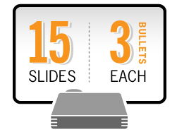
    Ideal PresentationsCreating a powerful presentation depends on content that is clear, concise, and compelling to the audience. You should be able to make your presentation in thirty minutes or less, and by using fewer than 20 slides. Each slide should not be overloaded with too much information; three to four talking points per slide (short phrases or sentences) will help direct the presentation and keep people’s attention.


    Using “rich media” in a presentation, whether graphics, stock images or illustrations, or even audio clips, can enhance viewer’s attentiveness to your presentation. Remember that brevity is essential: video clips should be no more than :20–:30 seconds in length, and audio the same length.

    Step 3: Keep them focused on you, not the screen.

    How many presentations have you been to where you ultimately found yourself checking email or social media feeds because you were bored out of your mind, or the presenter was not interesting? The best presentations are the ones that keep your audience engaged.

    One way to engage with your audience is to move around. Look people directly in the eyes, and don’t read directly from your slides. Simply preparing by reading through your talking points from each slide will help you know what to say, and when.

    Finally, avoid putting all of your content on each slide: viewers will simply read ahead and then tune out. You want them to be focused on you, not the screen.

    Step 4: Make it professional.

    The final part of a successful presentation is how it looks onscreen, and if it is consistent with your brand. To that end, be sure to use master slide templates that incorporate your logo, color palette, and other brand elements. Even graphics such as bar or pie charts should look like they are part of your brand.

    Animations and motion, while neat visual effects, are very distracting to a presentation. Instead of focusing on what you are saying, the audience may become mesmerized by what is going on behind you onscreen. The most complex animation that we use is “Appear,” which helps reveal talking points one by one, instead of all at once; guiding the discussion and preventing reading ahead.

    If all else fails, call in the professionals.

    Professional designers, in addition to creating background slide templates, are able to distill complex information into simple visuals that anyone can understand. They can clean up and modify those generic looking Excel pie charts into graphics that match your brand standards. And, by utilizing their experience with other types of clients’ presentations, designers are able to offer a unique perspective on your presentation.

    By: Ryan Hembree, Principal | Brand & Creative Strategy

  • Carolina Blues.

    Carolina Blues. They didn't win the title, but their brand did.

    North Carolina fans might be singing the blues after losing the title game of the NCAA Men’s Basketball Tournament, but they can still stand proud as one of collegiate athletics’ most powerful brands. That’s because when they take the court, the UNC Tar Heels don uniforms that are instantly recognizable with their distinct blue color.

    Other brands “own” colors within the marketplace. In soda, Coca Cola owns red, in shipping UPS owns brown, and in telecommunications T-Mobile owns magenta. No other collegiate teams (or brands) come to mind when you think of Carolina Blue, the light blue that is “not powder blue… not baby blue, either,” according to an article in the Wall Street Journal.

    ‘So what’s the big deal?’ you might ask. The big deal is that just last year a new standard “Carolina Blue” was established (Pantone® 542) for the entire University (gasp!), and one that matches the uniforms of UNC’s basketball team. While the “new” color might seem like a very subtle shift from the old (Pantone® 278), the reason for the change has to do with how students, alumni and fans experience the brand across different media—from online and mobile devices to ultra high definition television.

    Carolina-Color-comparison

    With higher resolution and increasing quality screens, we can see every minute detail of a game, from the expressions on the players’ faces to their sweat-soaked jerseys (which, incidentally, changes the color even more). We can even notice the discrepancies between the color of UNC’s uniforms and the color of fans’ shirts and face paint. Dean Smith, the legendary UNC basketball coach, noticed that his players’ uniforms looked washed out and gray on the very first color television sets, so he had them made in a more vivid color. Consistent color matters, particularly to a brand with such a rich heritage and history.

    While it pains me to write an article about North Carolina (myself being a Jayhawk from the Roy Williams era of KU basketball), how the Tar Heels have adapted their blue to meet the needs of different media and viewing experiences is an excellent case study in the importance of color (and its consistent application) in branding.

    By: Ryan Hembree, Principal | Brand and Creative Strategy

  • Average Bowl 50

    The biggest game of the year with the highest number of viewers, Super Bowl 50. Fifty years of football champions and product advertisements. The Super Bowl is known as much for its commercial advertising as it is for its football. Whether or not someone tuned into the game for the commercials or the game, the trend of viewers’ preference has dramatically changed, but what’s causing this?

    In short, millennials. According to HuffPost/YouGov poll, 26 percent of young Americans said the “best part of the broadcast” is the ads. The NFL is getting a reputation as the “No Fun League” because touchdown celebrations like these

    are penalized when every other sport is allowed celebrations like these:

    Even golf allows for bigger celebrations. Most players celebrate to get their fans hyped and excited for their teams. Still, one quarter of millennials find pro football to be “boring” while the older generations still prefer the on-field action to advertisements.

    However, as one of the largest mass communication opportunities, major brands create entertaining and compelling commercials. The ads are made for “the big game” but fall short of being suitable for any memorable moments past the next day. The NFL and CBS are aware of the large number of viewers for which they charge accordingly. This year, 2016, a 30-second commercial slot hit an all time high at $5 million. The increase in slot advertisement has gotten out of control and some major brands like Gatorade, Reebok, Nike, Ford, and Chevy decided  against having an advertisement in this year’s Super Bowl.

    Although the price tag of advertisement is extremely high, it’s not likely the reason corporate titans are considering it the deterrent of the “big game,” but because, in part, of the internet-inspired atomization. Super Bowl advertising hitmaker, John Immesoete says, “There’s a lot of other places to spend your money that are more targeted, and a lot of admen like to do it like that.” Immesoete is known for his hit ads for Budweiser and other big name companies. This erosion of big advertisers means the Super Bowl features a shallower pool of creative talent adept in crafting ads that can appeal to multiple generations and demographic groups. Also contributing to the lack of creative talent in advertisements is common household devices with TiVo, DVR, and services like Netflix which make ordinary TV ads easily avoidable.

    Companies noticing the trend of ads being passed is a big reason to believe it’s not worth the money to hire and develop talent. To complicate matters, the same social media and 24-hour news cycle have turned advertising into a niche business. This has increased the scrutiny of Super Bowl ads. While the payoffs of good advertisements are positive, with more of the tools needed to achieve that, companies’ desires to invest have diminished and the costs of failure have increased.

    “You become a lightning rod for controversy, Immesoete said. “Now the risk is so high, people get cold feet.”

    Business professors, Tim Calkin and Derek Rucker, from Northwestern University made similar claims in a HuffPost blog. They noted it’s also hard for a brand to stand out in such a crowded field of competitors. In 2015, there were 71 national spots, not including network and local promo spots. Immesoete still thinks many of the brands sitting out of the big game and those who’ve booked less airtime are making a mistake. There is, however, one brand plenty of people did not miss seeing, GoDaddy, and its commercials. The strange didn’t stay away with GoDaddy, Mountain Dew introduced “Puppy Monkey Baby” and confused a lot of viewers. Even scarred some with an image not to be forgotten anytime soon.

    While a lasting effect is ideal for companies, a lot of viewers don’t remember the brand associated with the creature.

    With the day-to-day business being affected by the trend set by millennials, the advertising is not playing to a big quality of millennial behavior: nostalgia. Katy Perry figured it out for her halftime performance by bringing back rapper Missy Elliott. Being nostalgic is not exclusive to Super Bowl advertisements, McDonald’s rebooted the hamburglar, Coke brought Surge back and Crystal Pepsi saw shelves again for the first time in 20 years. According to Jamie Gutfreund, CMO at agency Deep Focus, “Nostalgia brings back that lovely, fuzzy feeling about how good things were back in the day.”

    People want to relive that feeling and brands know they can trigger those emotions in their consumers. Does anyone remember E*Trade commercials with the baby? How about any of these “greatest” Super Bowl ads?

    Nostalgia works, because millennials have a stronger affinity to the sentiment than previous generations. Nostalgia not only evokes better times and a sense of belonging, but also makes younger consumers feel more fashionable. This is not a new tool but perhaps it is a forgotten one. With a majority of the game’s viewers being millennials and the rest being Generation X and baby boomers, advertisers should go back to trends that produced buzz and printed t-shirts. Many viewers tune in for the best TV commercials because this is the one time people want to watch commercials.

    However, with the current trend of advertisements becoming less like entertainment and encouragement, and more like sleep aid alternatives, companies may only have another year or two to turn it around. The NFL and CBS should also be concerned because unless there is a change in commercial concepts, viewers may turn the channel to alternatives during a break, like the Puppy Bowl instead of watching the commercials. This will decrease viewer data and make the There is a new trend that is successful: the greater cause. Colgate’s commercial about
    “Every Drop Counts” sends the message to preserve water by brushing your teeth with the water off.

    Last year, “Like a girl” was a big hit amongst viewers because it empowered women instead of objectifying them.

    Coca Cola is one of the largest, most consistent companies to “Share Love. Share a Smile. Share a Coke.” Coke entertains viewers with graphics (including turning bottles of Coke in a vending machine into an animated world) and plays on heart strings.

    Who could forget about the polar bears.

    The past few Super Bowls have been accompanied by more and more disappointing commercials with only a handful of good ones. Formerly known as the greatest commercials of the year, are beginning to lose their touch…quickly. Millennials are nostalgic with many things and maybe advertisers should follow their lead in remembering “the good ol days.”

    Sources:
    Dua, Tanya. “Why Millennials Are Afflicted with ‘early-onset Nostalgia’ – Digiday.” Digiday. Digiday, 14 June 2015. Web. 9 Feb. 2016.

    Marans, Daniel. “Why Some Top Companies Decided Super Bowl Ads Aren’t Worth It.” Huffington Post. HuffPost Sports, 5 Feb. 2016. Web. 9 Feb. 2016.

    Spies-Gans, Juliet. “Millennials Are Watching The Super Bowl For The Commercials, Not The Game.” Huffington Post. HuffPost Sports, 4 Feb. 2016. Web. 9 Feb. 2016.

    Videos belong to their respective owners as found on YouTube. Clips belong to rightful owners and companies, Indicia does not claim to have any ownership in the video or the content therein.

  • Google Gets a New G

    On September 1st, Google unveiled a new brand identity for its family of products and services. You may not have noticed, since the changes are relatively subtle, but for brand geeks like me, however, Google’s new brand is big news.

    The Google Logo before and after September 1, 2015.

    The new Google logo has been updated with a modern sans-serif typeface that is more clean and professional looking. The essence of the logo is the same… it utilizes the same color scheme, and when used for different products, the same recognizable icons. On first glance, it might be easy to miss the changes; after all, you use their search and communication tools to find information you are looking for, not paying attention to the logo. In this way, the new brand is not too distracting.

    new Google G iconWhere the new Google brand becomes more apparent is in its application to the various products and services offered. GoogleMaps is probably the application that I use most behind search, and gone is the lowercase “g” that signified it. Replacing it is a much stronger and bolder “G” that is more pronounced, especially in the icon form.

    While reaction to the new logo family has been mixed (an article by Sarah Larson in the New Yorker pans it as being untrustworthy and inauthentic), I for one think that it is a smart move. The reason why is simple: consistency of the brand across all media and applications.

    Good Brands are designed with scalability in mind. At small sizes the lowercase g becomes illegible and resembles the number 8.

    As we wear more smartwatches and other wearable devices with smaller and smaller screens, the old serif-based logo doesn’t work as well as the new uppercase “G.” And this fact, according to Google’s official blog, is exactly why they made the change:
    “These days, people interact with Google products across many different platforms, apps and devices—sometimes all in a single day.…[and the new logo] reflects this reality and shows you when the Google magic is working for you, even on the tiniest screens.”

    Google did not undertake a rebrand lightly. It was not because they felt like it was time for a change, or that they felt it was out of date. It was the result of the direction in which business is heading…and that path leads to smaller and more prevalent screens. The brand must work not only on desktop computers, tablets, and phones, but soon it will need to work in much smaller applications as well. The new Google brand is able to do just that.

    By: Ryan Hembree, Principal | Brand & Creative Strategy

  • Nest’s Next Big Thing? Water Conservation in the home

    Nest's Next Big Thing? Water Conservation in the Home


    Did Tony Fadell (the founder and inventor of the Nest Thermostat) tip his hand when he recently wrote a story on the future of the Internet for the Wall Street Journal? In the article he discusses how humanity will all be connected, the devices we use will be connected (augmented reality), and that all of the data that exists will be cultivated and turned into more useful information that we can act upon.


    According to Mr. Fadell in the article, “there’s plenty of data to pinpoint exactly how much water we use and what we use it for. But most of that information isn’t delivered to us in a way that makes it easy to use less. In the future, information will serve us better, allowing us to learn more about our behavior and see how we can improve.”


    Nest Thermostat


    Has Mr. Fadell offered us a glimpse into what is going on behind the scenes at the notoriously secretive Nest Labs (part of Google)? Is the next Nest product a device to monitor and inform us how much water we use at home? My bet is that it is.


    Let’s just pretend for a moment that Nest is creating a “Nest Conserve” if you will. The name would make sense, as the Nest smoke and carbon dioxide detector is called the “Protect.” But where would it go within the home? What could it look like? Would it be a large device for our hot water heaters, or smaller gadgets that attach to the various faucets within the home?


    Nest Protect


    In my opinion, the thing that seems to make the most sense is that the Nest Conserve would address the biggest water uses people have: Irrigation (as would be necessary in California where there has been a substantial water shortage); Personal use (whether cooking, cleaning, flushing toilets, showering, etc.); and Appliance usage (dishwashers and laundry machines are the biggest culprits).


    Imagine being able to know exactly how much water you use each day, and where you use it most? I would love a way to show my 8-year old daughter how much water she wastes when she takes a 20 minute shower (I mean really, how could such a little person take so long to clean? But I digress). I think the biggest problem with water usage is that people just don’t know how much they use. If they did, maybe they would use less.


    I, for one, would welcome a Nest Conserve (or whatever they would call it). I have three of the Nest Protect smoke/CO2 detectors and have a couple of thermostats at my office. Nest has made complex devices simpler to use, and connected them in a way that makes it easy to understand the data. And that (understanding data to make more informed changes in behavior) is exactly what Mr. Fadell’s calls for in his article on the future.


    By: Ryan Hembree, Principal | Brand & Creative Strategy

  • OK Joe’s, Say it ain’t so!

    Joe's Kansas City Logo comparison


    Since announcing last month that they are changing their name, there has been a tremendous backlash against the barbecue joint formerly known as Oklahoma Joe’s. The landmark restaurant, with three locations, will now be known as Joe’s Kansas City Bar-B-Que.


    Why the name change? There have been all sorts of speculation, from legal reasons (they had to because of former ownership), to the fact that the owners flat out wanted to change the name, so they did. In their own words (on the company website), the change came because it “reflects the reality of our identity—we are a Kansas City company…Kansas City barbecue. It’s what we’re all about.”


    I would offer another, more strategic theory for the name change: they couldn’t own the name “Oklahoma Joe’s.” Having the exclusive right to use that name in other cities, states, and even countries is the first and necessary step toward franchising their restaurant concept.


    The reason franchise-ability makes the most sense for OK Joe’s is to look at another fast-casual restaurant that went through a similar transformation: Panera Bread. When founded in 1987, it was originally Saint Louis Bread Company (and restaurants in that city still go by that name). The majority of the chain’s 1,800 restaurants go by the name Panera, which has its roots in Latin, meaning “breadbasket.”

    The evolution of the Panera Bread brand, from the original Saint Louis Bread Co. logo to the latest version at right.

    Whether or not this theory proves correct is still unknown, as is the verdict on whether or not it was a good decision. From a brand identity perspective, there isn’t much difference between the old Joe’s logo and the new one, other than the emphasis on “Kansas City.” In fact, the “new” logo has actually been in use on the bottled sauces and at the restaurants for quite some time. My biggest concern would be that people might mistakenly read the new logo as “Joe’s Kansas City—Oklahoma Bar-B-Que.”


    The Joe's logo has readability issues. Since people read left to right, top to bottom, starting with the largest items first, it is possible to read the name of the restaurant as Joe's Kansas City Oklahoma Bar-B-Que.


    By: Ryan Hembree, Principal, Brand Strategy


    Sources:

    https://doug-worgul.squarespace.com/in-the-news/

    https://www.panerabread.com/en-us/company/about-panera/our-history.html

    http://money.cnn.com/2012/07/17/smallbusiness/panera-ron-shaich.fortune/