Author: Ryan Hembree

  • “Wipe” with a Towel.

    Flipping through WOOD Magazine, a simple column ad layout caught my eye. The ad said “TUB O’ TOUGH” and the full background was yellow. The main visual was a large cylinder ‘TUB’ of towels. I thought to myself, “well, that’s cheesy.” But because of the ad’s simplicity and undertones of a construction feel, I was intrigued to find out more.


    Tub O' Towels packageWith a quick search I found out that these are heavy-duty wipes and have a pretty hefty claim—taking off anything from adhesives to lipstick, tree sap to permanent marker. The website gloats a bigger (10 inches by 12 inches), tougher (muscle-weaved) and soaked with a knock-your-socks-off cleaning solution. I guess these aren’t for cleaning your kids’ diaper messes. If I heard these claims and saw the previous package design, I might have laughed. But with the new design, it makes me think these are all plausible.


    The new package is bold, bright, and eye-catching in a simplified way. The logotype uses a thick slab serif font which gives it a heavy-duty feel. The typography is large and in your face, and some dimensionality is portrayed with two large liquid drops in the background. The use of yellow is an interesting color choice—it makes me think of a dingy stain, but paired with black it helps the brand exude a ‘get-it-done’ feeling. It makes me want to puff up my chest and boast about using a wipe (for a greasy stain of course), even though  the brand’s advertising says, “Don’t call ’em wipes, wipes are for wimpy jobs.”


    The aesthetics of the package make the brand claims believable, while the use of clever slogans and advertising makes me want to try them. Whatever I’ll be cleaning, I’ll be sure not to call them a wipe.


    —Justin Leatherman, Art Director

  • A Cheerful Tear

    On a recent trip to Target, I was taking my usual route to grab the essentials: toilet paper, paper towels, and laundry detergent. As I entered the laundry aisle, I knew I would be grabbing the name brand that was on sale, or at least whichever was cheapest. As I reached down to pick up a bottle of Gain detergent, I literally did a double take as I noticed the midnight blue Cheer bottle resting on the shelf.


    Cheer


    For the first time, I had actually noticed that Cheer existed. Apparently, the P&G brand tried to be noticed several times in recent years, as this redesign was their third attempt at a different look. I’d have to say that this is definitely the best rendition, and in my opinion, the best looking bottle on the shelf.


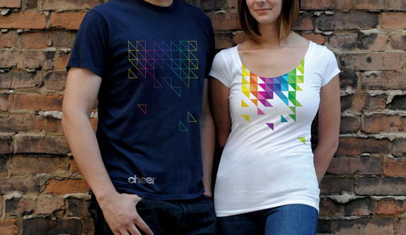
    The new design is clean and simple with a beautifully bold color palette to liven things up. The teardrop label contains a triangulated pixel pattern of the color palette, the refined Cheer logotype and a small tagline that reads “Stay Colorful”. The bright colors pop perfectly against the dark blue of the bottle, while the white space with the Cheer logotype provides just the right amount of simplicity to contrast the colors. Typically, I would disagree with the use of the lowercase “e” in the Cheer logotype, but in this case, the angled crossbars seem to add the necessary “cheerful” touch.


    Cheer logotype


    The folks at Landor provided the brains and skill to create the revamped Cheer brand, striving to connect with the untapped Gen-Y consumer. It seems smart, in my opinion, to grab hold of a younger demographic in an industry where it hasn’t necessarily been done. Gaining loyalty among college students could easily result in a lifetime connection with the Cheer brand. Landor has managed to create the brand by utilizing classic design sensibilities with a modern, bold approach to color and package design. Overall, I think they’ve married the two very well and have gained a new customer on this end. Oh yeah, did I mention this stuff smells incredibly good?


    Neil Ryan, Senior Designer


    cheer_rebrand_04_billboard

    Cheer shirts

    cheer_rebrand_05_cu721B209


  • Animated GIFs are back?

    What is it about the repetitive motion that captivates us? We, as humans, seem to enjoy a continuous rhythm in music, a monotonous movement of the rocking chair, a captivating frame progression of an animated GIF.


    What? Animated GIF?? Are you talking about those cartoons of a smiley face winking0023that winks, or a color-shifting acid mushroom, or a cat with a machine gun?cat


    Most, by default, will react negatively to these “pioneers of web animation”. It seems like they’ve been around to annoy us ever since pre-AOL times. That is correct – they are very “oh so 90’s”, and they are back.


    Animated GIFs have been on the Web since it’s beginning. They were fairly easy to make and they brought some motion to the “prehistoric” static web pages. They represented our mood (smileys), creativity (cartoon GIFs), thoughts (photo GIFs), secret thoughts (porno-GIFs), and humor (weird guy dancing). Those 3-to-30 frame animations, at times, helped us express ourselves on the Web better than words did. They brightened our browsing experience and never failed to annoy us.


    1314185416_nobones_dance

    Animated GIFs got pushed away with the arrival of FLASH, online video and JavaScript-driven motion content. Although, there has been an interesting GIF revival lately. Some designers out there have been secretly practicing their guilty pleasures – resurrecting the animated GIFs. Carefully crafted GIFs have started to pop up all over the Web. The ones that deserve attention are actually fun, not so annoying, and even beautiful! Common thread in most of them – they are nostalgic. It isn’t just the content that makes them nostalgic – it’s the actual idea of an animated GIF, it’s historical significance to the Web. It’s like looking at some old artifact that looks strange, but you can’t look away.


    home-alone_a_GIFSoup.comWith FLASH animation being actively pushed away from the Web, there isn’t much surprise that the designers are researching other options. The “old school” GIF just happens to be one of the alternatives. My best wishes to the GIF to long live. I just want them to be crafted and placed responsibly – it does get annoying to see something like an animation loop of Macaulay Culkin.


    By Max Kunakhovich, Web Designer

  • Schlotzsky’s is the Schit

    profile image


    Recently while visiting one of our favorite sandwich shops, I noticed something a little different about the environment. My experience felt a bit more well-rounded. As I did a 360 around the shop I began to realize that there were lotz of things that were a bit different. The new furniture, new signage and a common theme on all packaging made it clear that this would not be a typical square meal.


    If the catchy title and terrible puns in the opening paragraph haven’t given it away, we are talking about the new branding effort put forth by Schlotsky’s. The new brand, or re-brand plays off of the circular shapes of the bread (or buns) that have made the Austin-based restaurant chain so successful. The ‘Lotz Better’ campaign is meant to present the visitors with a fresh, bright and contemporary feel.


    The integration of the character attributes to each of their chip and hot sauce (that sweet-sweet hot sauce) packages adds personality at every customer touch-point. The simplicity of the character attributes are what are the strengths of each element of packaging. The franchise is blatant about the consistency of the circle that adorns the new decor and products. By adding horns and a devilish goatee to the circle on their hot sauce bottle, to onion sprouts on the circle on the sour cream and onion chips, to a bold black jagged line through the circle on the cracked black pepper chips, and the line art of a charcoal grill on the BBQ chips,  it brings more interest and entertainment to the dining experience. The personality of the product is completed with the catchy saying ‘bags need chips, not shoulders.


    schlotzskys_2

    schlotzskys_1

    A true testament to the rebrand was when I witnessed a group of patrons interacting with the new packaging. They were holding the chip bags and hot sauce bottle while turning them around, viewing all that the new look had to offer. This is gold in the branding world. The longer that someone interacts with the brand and/or the more impressions you can garner generally equals better returns. Admittedly, I do not think that they were checking out the caloric values, so something must have caught their eye.


    And as promised, ‘Every Bite’ was ‘Lotz Better’…especially with the hot sauce.


    By: Josh Christie, Principal | New Business Development

  • Nice digits.

    They may be mounted on your house, stuck on your mailbox, spray painted on your curb, or painted on your garage door. But the fact is, you have them and so do all of your neighbors. No, not Gerald your garden gnome—your house numbers.


    I love typography and numbers. So it only seems natural for me to look at and analyze peoples’ house digits. These small but powerful pieces of communication combine both function and form.


    People focus on many different aspects of their home, but forget about the style they can inject into their house numbers. This simple typographic selection is the first ‘branding’ of sorts that visitors will see upon arrival. Think of it as a logo for your house; the numbers your house sports can portray a variety of attributes about your household. Choose a geometric typeface like Neutra and your house may look modern; choosing to use spray painted numbers on the curb may show that you are apathetic or indifferent. Whatever the case, they will be seen by passers-by, visitors, and of course, the mailman.


    House numbers not only show your personal style, but originated out of pure function. According to www.ideamarketers.com, the history of formal mail service in the United States dates back to 1639, when the state of Massachusetts established the first government-authorized drop-off point for mail. Today, the USPS delivers to more than 141 million homes and businesses every day. Without those numbers, this wouldn’t be possible.


    So if they are large, small, brass, wood, backlit, painted or metal—house numbers must reflect your address and be visible on the front of your residence (unless, of course, you live in a Homeowners Association or neighborhood that specifies something different). The rest is open for interpretation,  so take some creative liberty and show some style. Are you due for a numberical makeover? Take a look the next time you pull into your driveway.


    Justin Leatherman, Art Director

  • Brand Experienced

    DISCLAIMER: We generally reserve this section for a true Thought on Design. Unfortunately for both of us, my team thought it would be a good idea to throw me into the mix (while I was out of town and unable to defend myself). Please send all complaints toinfo@thoughtsondesign.com with the subject line: ‘JC is Way Better at Marketing.’


    Anyway, here we go:

    As a brand experience firm we spend much of our time helping our clients develop their brand. We perform positioning studies with our clients’ executives and employees to determine what message should be communicated, how it should be communicated and who it should be communicated to. With some of our clients it is rare that we would have the opportunity to experience the true brand message in play.


    Roughly a month ago, such an opportunity arose that allowed me to experience one of our client’s brand personally. Somehow, while playing ‘Horsey’ with my kids, I injured my back. Being the stubborn male that I am, it progressed to the point where simple activities became challenging. One morning, as my wife was putting my socks on for me, she remarked that when our third child arrived in a few weeks that she would have 4 kids to take care of. Everything came to a head when my back seized up in our parking lot. As our Art Director wheeled me into the office in one of our chairs, I knew that it was time to get some help.


    After a quick call to our client liaison with Pain Management Associates, he immediately made an opening the same day and set the ball rolling. The scheduling person contacted me within 20 min. She was compassionate and added a light-hearted ‘so I hear we’ve got some back pain’ comment to ease a stressful situation. Upon arriving at the clinic, I received a welcoming shout from the receptionist. The doc took his time assessing my situation and determining what could be causing the pain (including a handy visual aide). He spelled out options for treatment, short-term and long-term. One thing that my doc said that set the tone for their brand message was that ‘my goal is to manage the pain, so that the pain doesn’t manage you.’


    After a series of two epidurals, some medication and rest, I am happy to say that I am pain free after a month. My doc took time to check in on me to make sure that the meds were working and the pain was under control.


    The perfect closer to this experience was when my doc referred me to a physical therapist. He pulled out a beautifully designed referral kit for Elite Physical Therapy, another Indicia client. Looks like I may get another opportunity to experience a brand in the family.


    My kids now have their ‘Horsey’ back, my wife only has 3 kids to worry about (sometimes she stills says 4, but it has nothing to do with my back), and the only time my Art Director pushes me in the chair is the occasional Friday afternoon chariot race.


    Kudos to Pain Management Associates for delivering on their brand promise.


    By: Josh Christie, Principal | New Business Development

  • CooperVision: Almost Seeing 20/20

    CooperVision compared

    Today, according to the National Eye Institute, about half of all Americans over the age of 19 have poor vision, myself included. CooperVision has been my brand of choice for contact lenses for over 10 years. Although they haven’t enjoyed the mainstream popularity of brands like Acuvue or Bausch + Lomb, they have maintained a high reputation with optometrists and eye care professionals alike. This March, CooperVision introduced a new brand identity designed by the global agency, Siegel+Gale. The new logo certainly draws more attention and flaunts significantly better typography. However, at first glance, I found myself questioning the head of cabbage floating above the logotype.


    After exploring the various brand elements, the meaning behind the logomark became more apparent. Although the attempt at creating a watercolored contact lens was a far fetched idea, the use of watercolor throughout the website, advertisements, and collateral made all the difference. The brand utilizes a painting and illustration style using bright hues and playful themes, which has a very personable and relatable feel. Diversifying with six different colors for the logomark, each “lens” is painted differently, giving a slightly different appearance to each mark. This casual uniqueness seems to subliminally show the confidence and swagger with which the brand lives.


    cooper


    This is a great example of how CooperVision’s brand experience feeds off of every element involved. If the logo had been created with no supporting illustration or theme, using only photographs or simply typography, the rebrand would probably be negatively accepted. The logo could have been criticized for being remotely reminiscent of a contact lens, looking more like a rock or some type of vegetation– instead, Siegel + Gale created a bold brand with an idea that will surely be noticed. The bright colors, combined with a handmade aesthetic, leaves little to dislike.


    “Overall, the system is designed to capture the vividness that exists in the everyday world, be as visually refreshing as CooperVision’s refreshing way of partnering with practitioners, while also bringing global consistency to a visually fragmented organization and establishing CooperVision as a clear masterbrand.”

    Siegel + Gale Project Description


    Overall, the logo is a stretch for CooperVision. The mark will be difficult to reproduce and surely not last as a timeless mark. However, what can be appreciated here is the strength of confidence and follow-through within the brand experience. This campaign will surely bring attention and recognition from many consumers, clearly putting CooperVision right back into focus.


    By: Neil Ryan, senior designer


  • A Clean Start to the Day

    google


    Every morning when I wake up, I open my eyes to see a ceiling (since I normally lay on my back for a while, trying to wake up). My ceiling, as most ceilings are, is clean, white and free of any clutter. For me, it represents a “clean start of the day,” the day that will start getting cluttered as I move along towards the night. I get this similar “clean start of the day” feeling when I open my Internet browser, because the first thing I see is the Google.com start page.


    As most of us know, Google is one of the most popular and most powerful search engines on the web. In fact, it is so popular it has become a slang term, for ex. “I Google-d my landlord before I moved in.” Behind its simple and stark clean homepage, Google packs a powerhouse of options for virtually any possible use of the Internet.


    So what is the deal with this simple 1996-ish homepage? Honestly, I don’t know. But allow me to address my opinion on it (please note: I am not going to go into the whole nitty-gritty of what Google can do for you, just the opinion of its homepage). I like it. As mentioned above, Google is the start of my daily web browsing.


    By default, Google’s home page contains a logo, a search box, and a handful of links. You could customize it with all kinds of other information if you’d like (I don’t). Yahoo (another popular search engine), on the other hand, immediately spits out a World (literally) of information, plus banners and ads. And Bing (the search engine option from Microsoft)… well, not only do its search results shock me with its “over-intuitiveness”, but it’s “Microsoft-ness” makes me slightly uncomfortable.


    I’m a web designer, so my job and my life are intertwined with the Internet. In search of relevant information I browse through multiple pages, portals, websites, blogs, forums, videos, emails, social outlets, unsocial outlets, and many, many, many etceteras. By the end of the day, I am loaded with all kinds of necessary and unnecessary information. So when I take my first step on the path of daily info web-quest, I prefer for it to start somewhere clean, clear, and direct.


    I’ll stick with google.com, simple as that. I like to start my day off with a clean slate. I love it–at least for now. (Please note, again: I do not, by any means, promote Google as your browser’s home page. This is just my personal opinion. Happy browsing!)


    By: Max Kunakhovich


  • HTML 5 point oh!

    HTML5 Brand compared


    Recently the World Wide Web Consortium (W3C) announced its branding of a new technological buzzword—HTML5. HTML5 is the newest markup for website building, meaning it is the newest code version that gives websites structure. It touts the ability to build stronger, richer web applications without the use of Flash.


    It may seem a little strange to be branding a publicly available, open source markup language, but the W3C doesn’t see it that way. None of HTML5’s predecessors (HTML 1, 2, 3 or 4) sported an official logo. So I have to ask, why is HTML5 worthy? As the most recent update since 1997, HTML5 adds many new features and streamlines functionality to render add-ons, rather than using plug-ins like Flash, Silverlight and Java, thus making your computer work less and deliver a better user experience. So, needless to say, HTML5 is a big deal.


    The logo is simple, powerful and bold. It’s personality seems to belong somewhere between a new tractor trailer brand and a superhero badge. It is progressively iconic, and will work at almost any size, which is very important on the web. The crispness is refreshing, and the subtle dimensionality of the mark is quite nice. It is good to see some dimensionality that doesn’t use the cliché web 2.0 glassy look. Designed by Ocupop, they say it “follows very strict geometric rules providing an incredibly adaptable yet stable and stylish identity.”


    Aesthetically, the shape of the logo lends itself to a web application, where it might be displayed as a badge of honor, visually similar to a coat of arms or crest. Something that seems to be quite important for users to know that a website is built using HTML5. And even if it is a little out of the norm for an open web platform to have a logo and brand, it works purely for uniformity of recognition. You can’t buy anything, you don’t call a phone number, but you can download various logo formats (including vector) of the logo for use under the Creative Commons 3.0. It’s a non-traditional way to brand.


    All in all, the logo works well–even if it is a brand for a publicly available markup language. It doesn’t try too hard to be noticed, while at the same time demanding attention due to its visual strength. But wait, there is one problem—where is the ‘.1’ going to go when the upgrade is issued?


    Justin Leatherman, Art Director


  • Go ahead, laugh it up

    Comedy Central old and new logos


    By now, you’ve probably noticed that Comedy Central has unveiled a brand new logo…that is, if you are as obsessed with Tosh.0 and Its Always Sunny In Philadelphia as we are. The twenty year-old network publicized their fresh, and very different, logo (designed by the talented New York based group, thelab) in December of 2010.


    First reactions were, of course, negative, as most corporate rebrands are. Many complained about its lack of character and its ties to the copyright symbol – two qualities that actually seem to be making it stronger. The new mark is, simply put, a “C” nested inside a backwards C. Even Comedy Central jokes about its likeness to the copyright symbol on their Twitter page by saying “The only difference between our logo and the copyright symbol? The gap.” Accompanying the mark is a logotype set in a bold sans serif typeface. The words play off the mark, flipping the word Central upside down and backwards. Sure, the copyright symbol has been around since the beginning of intellectual property rights, but this allows for Comedy Central to be clever with its use – and they are doing just that. In their promotional video, as well as icons of characters from shows, they have placed the “CC” icon exactly as the copyright icon would be used. Armin Vit from Brand New puts it perfectly, “While the copyright symbol demarcates as ’hands off,’ Comedy Central’s logo demarcates as ‘this is funny shit.’”


    characters


    Opinions on the mark’s so called “lack of character” and “boring” characteristics are to be expected from the typical television audience, who are constantly flooded with shiny surfaces and drop shadows. The strength in the new mark is its simplicity – not dullness – and its memorability. The humor in it may be a bit dry, but the backwards “C” and flipped “Central” provide just enough absurdity to give the mark relevance. Chances are, the next time you see the “CC” logo on the street, you won’t think of how boring it is, but you’ll remember the last time you laughed while watching the network.


    In their promo commercial, Comedy Central is using the mark with energy and wit, which gives it all the life it needs. Accompanying this cleverness, the new branding has utilized an elegant italic serif typeface to present paragraphs of copy. They use it playfully, not giving the viewer enough time to read what is actually written. In my opinion, this is smart marketing, driving the end user to find the video, pause it, and read what is actually written, which in turn drives the brand strength even further.


    All in all, it seems thelab has hit a home run for ComedyCentral with the new branding. They have developed a mark that stands apart from the crowd, yet subtly embodies ComedyCentral perfectly. Who said being funny can’t be sophisticated?


    By: Neil Ryan, Designer