In March, The New York Times announced that it had been working on a complete redesign of the NYTimes.com. Since this is the newspaper’s first attempt at redesigning their online presence since 2006, the big focus is on creating a user experience that works well across all platforms and correctly displays in different media.

The new NYTimes.com article experience (top) versus the old (bottom).
The first prototype released focuses on the article experience: featuring minimal content on the sidebars and a three-column layout, the full article is now the centerpiece of a clean page. A header image is accompanied by the article title and byline, similar to the way articles are presented in print.
Mobile applications have changed the way users interact with content and their behavior towards scrolling as changed. These modified behaviors have made the jump to the desktop, and we now see websites using scrolling as part of the user experience. The NYTimes.com articles are no longer divided between multiple pages so as to prevent the user from having to scroll through long bodies of text, as used to be the norm.

The new NYTimes.com uses scrolling to show full articles but also to disperse the sidebar content throughout the page so it no longer takes attention away from the main article. As you scroll you also notice the main header change. The first iteration appears when the article loads and it encompasses the way the user can interact with the whole site from within that particular article. The related content disappears as you scroll below the fold and only the main buttons stay, which I think helps keep focus on the content and minimize distractions. The main navigation is at the top left, under what The Verge calls “the now-familiar three-line ‘hamburger’ icon” we see across mobile apps.
Personally, I love the focus that has been given to the content, with the article header across the width of the window and the body copy centered below. The secondary content shines because of the white space that surrounds it as you scroll down the window. Because every element of the sidebar has its own little area; as people interact with the site, sidebar items will become less obtrusive until you need them and know exactly where to find them.

Overall, the prototype released is leaps and bounds better than the current NYTimes.com, and a fine step in the right direction. Back in 2006, it was hard to envision the web would look like this. The conceptual decisions to clean up the interface and use a mobile-first user experience foundation are a reflection of the era we are living in. And the New York Times is finally jumping both feet in.
By: Emilio Servigon, Web Designer


 When I first saw the new Flight Symbol, I was instantly impressed by its polished and minimalistic qualities. Initially, I thought the mark was supposed to be peeling away, as if the airlines were emphasizing their timeliness and quick trips. The gradients and 3-D effects of the symbol are done tastefully, however the “American Sans” typeface seems to be an afterthought. The two certainly don’t relate to one another and the type doesn’t reflect the consideration and refinement demonstrated in the mark. Overall, I feel Futurebrand was successful in creating a fresh spin on the elements of the American Airlines brand that everyone has come to know and love.


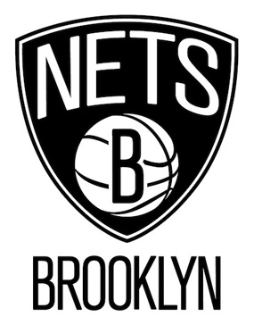 I applaud the original look and intent to differentiate. I enjoy the visuals from a distance–not overdone and perfectly simplified. But does it have what it takes to be timeless and sophisticated? Looking closer at the primary logo, it seems to have some odd tendencies. The text NETS feels steamrolled and thrown on (the S looks as if it has been steamrolled twice in opposite directions). The space to the top left of the N and to the to right of the S is very strange–the whole word would feel crisper had it followed the shape of the outer shield. The basketball lines, although accurate, would fit better with the iconic look if the line weight was the same throughout. With the addition of BROOKLYN placed under the shield, it makes the whole logo feel like it is going to tip over due to the relationship between the shield and BROOKLYN text being disproportional. Decreasing the size of the shield would benefit the look.


 With a quick search I found out that these are heavy-duty wipes and have a pretty hefty claim—taking off anything from adhesives to lipstick, tree sap to permanent marker. The website gloats a bigger (10 inches by 12 inches), tougher (muscle-weaved) and soaked with a knock-your-socks-off cleaning solution. I guess these aren’t for cleaning your kids’ diaper messes. If I heard these claims and saw the previous package design, I might have laughed. But with the new design, it makes me think these are all plausible.