Category: Thoughts on Design

  • Goodwrench

    Goodwrench


    As a young, female car owner, I find myself often lost in the mess of my machine’s inner mechanism and in the vastly growing market of car products. I don’t know much about how my car runs, why things go awry or why I need my air filter replaced after every oil change; what I do know is that it always costs me a lot to maintain my car. And when high-prices are the case, (and they are, more often than not) I like to know where my money is going.


    Since the 70’s, GM Goodwrench has stood for honest, no-jargon mechanics sure to get your car back on the road in no time. The old Goodwrench logo was a classic mark; set in Futura, it was sturdy, heavy, and sharp. It communicated a certain weight reserved for bulky metal instruments and power tools (see: DeWalt, Stanley, Bosch), but as technologies advance—and cars fall under such a category—a new look is in order for this company.


    Mimicking the ubiquitous power button, Goodwrench’s new icon looks to the future of cars, and anticipates its close relationship to computers. The mark’s glossy effect adds to this, but also emulates its predecessor, the GM block. The logotype’s new, and slightly modified, letterforms (particularly those with bowls, like the “G”, “o”, “d”, and “e”) have discarded Futura’s geometric limitations, and have transformed into something stronger, more advanced. Previously, the “e” had served as a relief from the monotonous letterforms, supplying a little bit of personality in the cold sans serif bunch; Now the slanted “e” has been carried over for traditional reasons, as it is identifiable for the brand (its the little things that count!).


    The new Goodwrench brand doesn’t stop with their identity, as is evident in a series of new television commercials that feature a “Web 2.0” reference. Mirroring the look and feel of most Apple products, everything appears on a muted color background with a mirror-like effect beneath it and takes note of new icons for “Tires”, “Oil”, and “Repairs.” It’s like watching a website in motion: clean, user-friendly, and information-rich.


    The computer-related brand evolution is an interesting and smart move for GM. Not many other auto care providers have taken this forward approach (i.e. Midas, Firestone, Meineke, etc.). Goodwrench is presenting the internal combustion engine as more than an archaic device—one that hasn’t changed since 1905—and is giving us a glimpse of the future of the auto industry. Finally, it just makes sense if you’re going to sell luxury cars as fine-tuned machinery, that you would have mechanics to match the description.


    By the time cars become more like computers, I’ll know even less about mine. Even so, I know I can rely on Goodwrench to fix it—especially with an identity like this one.


    By: Ashley Allen, designer

  • Walmart’s logo refresh safe or smart?

    Walmart Logo, Old and New


    Walmart recently unveiled their new logo sporting a hyphen-less, one word logotype with smooth, round letterforms and a yellow asterisk. This may go unnoticed to the casual viewer, but some are wondering, why the change? Walmart will most likely be spending millions of dollars to change store signage and truck graphics over the next several years, and all for a simple logo change?


    At first glance, the new logo may seem boring and intentionally safe, exactly what one would expect from a powerhouse, mega-company trying to soften their image. In comparison, the previous logo was stamped with patriotism; a red, white and blue palette with a star to replace the hyphen. The updated logotype has been set in lowercase, rounded, and the colors have been toned down to a gentler blue and marigold.


    These particular changes may go unnoticed by some, but it will be hard to not notice that their local store has taken a step toward the “softer side”. This can be interpreted as an attempt by Walmart to let the public know that they are “going green”, which in fact, they are trying to do (I can’t help but be impressed by the company’s efforts to reduce energy use, maximize fuel efficiency in their trucks, and reduce packaging.) The logo may look generic or safe, but in some ways, Walmart is exercising clever tactics by employing the typical “green marketing” attributes like rounded letterforms and natural colors. They recognize the style of current product packaging and labels, such as those found in the natural food market, and are taking advantage of those trends to influence prospective customers.


    While average customers may notice the new logo, or at least its resemblance to an organic food product label, the modified mark will most likely not deter them from shopping at Walmart. However, it may influence prospective customers to visit the store after seeing the softer, cleaner, friendlier brand. If, in fact, Walmart understands that the majority of the public will interpret the new logo in this manner, the refresh would be quite intelligent.


    Overall, I feel the previous mark was not the strongest, most successful logo, but it had a strong recognition value. It said, “We are Walmart, we’re huge and we know it.” Throw that star in there, and it says “Yep, we love America just like you.” The new warm and fuzzy sunshine logo will obviously become well known because of the establishment behind it, but looks like it could be found for sale on a logo creation web site for cheap. Don’t get me wrong, I believe Walmart may have made an intelligent move by taking the safe route: a generic logo that is in line with current trends; but I do think the new logo could be drastically improved by removing the tacky sun/asterisk/flower element, allowing the logotype to do the talking.


    By: Neil Ryan, designer

  • Do you know Jack?

    Jack in the Box Brand Update


    Thinking outside the box when it comes to recreating a brand identity is generally a good idea; jumping completely outside the “jack-in-the-box,” especially when it comes to an iconic brand, may not be so strategic or beneficial. That is exactly what happened shortly before the new year, when the west coast-based fast-food franchise Jack in the Box revealed its new identity. With little ties to the original, it seems this brand may be veering too far from the equity they’ve built over the past 58 years.


    The new logo is quite a departure from the old. It features a teetering box with bubbly typography in which letterforms tend to ooze into one another. The new logo contains few elements from the old, only referencing the red box. New elements such as the scripty “Jack” and the detached, futuristic “in the box” clearly take the brand in a new direction. Some argue that the swoosh descended of the “k” resembles a smile…like a clown, perhaps? Or maybe it is meant to resemble a more literal silhouette of the well-known “Jack,” the spherical-head with pointy hat? The a-symmetrical balance of the new logo is also unsettling; I can’t get past the visual awkwardness created by the two-point perspective of the box and flatness of the logotype, along with the disjointed “in the box” tacked on at the bottom. While the dimensional box is an interesting take on the original flat shape, it bears an undeniable resemblance to the lesser-known burger joint, White Castle. Had the brand name not been split up, with “in the box” outside the box, I feel that much of the awkwardness of the new mark could have been resolved.


    Though the new mark itself doesn’t satisfy my visual taste buds, I do like its integration into various applications, including new packaging patterns. The icons used to signify the cow, chicken and fish are a nice, modern touch, and clearly reference the type of meat that each package contains. The bold, saturated colors of the icons are also very appropriate and fitting for fast-food. The fact that the icons themselves have no dimension in relation to the box shapes behind them doesn’t really bother me; the boxes actually read better as abstracted objects rather than more literal ones.


    While I appreciate Jack-in-the-Box’s recognition of brand revitalization, and their attempt to revamp their identity and implement new graphic elements, it seems a simple facelift could have sufficed without overhauling the logo completely. Some have attributed this re-brand to be more in line with that of a toy company or entertainment brand—and I tend to agree; it seems a bit too retro to become a timeless icon for the brand. Regardless of the new logo, nothing will ever be able to change my love for their deep-fried egg rolls and thick, Oreo shakes.


    By: Kelly Campbell, Designer

  • Young, Hip and Bounce

    Bounce Packages Old and New


    Many people might not care about getting a slick, modern-looking box of dryer sheets when shopping…I’m more of a bargain shopper myself. The new identity and Bounce brand packaging however, compelled me to not only think more about my dryer sheets, but to also probe deeper into the redesign of this iconic brand.


    At first glance, I really enjoy the new look and experience very little disconnect between the old, established look that the product has had for years. It has some elements that work quite well, allowing it to stand out from other, orange, competitors on the store shelf, while others leave me questioning whether the re-brand really matters.


    The more I look at the design, the more I think we could easily be examining a rejected chewing gum package that was resurrected to become the new “rock star” of the dryer sheets aisle. For example, the minimalist approach to the package design is quite refreshing—by removing the blue call-out window and charts that used to live on the front of the box, the result is a much cleaner composition.


    Photos and color are used to differentiate between the various types of dryer sheets. I also like the halftone pattern that has replaced the old sunrise motif. I do like that the new product logo is more “bouncy” than that of the original. The lowercase “b” and ligature between the “u” and “n” makes sense, suggesting the swirling path this product travels while in the dryer.


    Both the front panel graphics and type treatments could have more depth to them, as it looks a little flat. Perhaps bringing back the blue outline around the type or adding a drop shadow to the white border would do the trick.


    I am curious about Procter & Gamble’s motivations—was one of the objectives to reach a younger audience? Is that demographic doing more laundry these days, feeling the need to be “cool” while they throw the whites into the dryer? This might explain the new type treatment of the logo. While I understand wanting to be hip when dealing with electronic products or junior wear, perhaps this tactic is too much for the laundry aisle. Overall, however, I think that the new package design is very effective at “bouncing” into shoppers’ field of vision and subsequently off the shelf.


    By: Chad Wagner, designer

  • SyFy: imagining greater opportunities

    SyFy logo


    As a fan of horror and science fiction movies (both good and bad), I find myself flipping to the SciFi Channel often. The cable channel has been very successful over the last 16 years of creating a world of its own, where viewers and fans of the genre can come together and experience original programming such as Battlestar Galactica, Stargate Atlantis, and studio-released sci-fi blockbusters and “B” movies as well. As we approach 2010 (“The Year We Make Contact”) SciFi is on the verge of a rebirth as SyFy. I believe the decision to launch a re-brand is a good one, especially since the organization wants to trademark its brand (due to the ubiquitous nature of the phrase “sci-fi,” the current name is not legally protect-able).


    Looking at the current identity, one thing I will miss is the distinctive planetary mark. I always thought it was well crafted, so much so that whenever I see a silhouette treatment of Saturn, I instantly think of the SciFi Channel. I do like how the type treatment for SyFy is not too far removed from the original logo, as it suggests more of an evolution of the brand instead of a revolution, and that any fears of too much change are unfounded. I have to disagree with some of the bloggers who say the channel is in the midst of an identity crisis. On the contrary, the new tag line “Imagine Greater” is a strong statement that says exactly where they are going…up.


    Based on early press releases, SyFy will keep the color purple as the primary brand color—which is good since I also have associated the color with the channel. I am curious to see if they will expand their accent color palette, since most current promotional spots are rather monotone. As simple and selfish as it sounds, my biggest fear of this re-brand is that SyFy will do away with the weird and quirky TV shorts they play during commercial breaks and in between shows–these shorts are of better production quality than half of the movies that are currently aired.


    From a business sense the SyFy re-brand is a great move. Expanding into other areas while protecting oneself legally is never a bad idea in my playbook. I just hope that SciFi Channel doesn’t forget who got them where they are now… those possessing an “inner geek” like me. Of course, TV does give them a very big platform to beat the new identity into the heads of its fans.


    By: Chad Wagner, web designer / syfy nerd

  • What’s so funny Pepsi?

    Pepsi Brand Update


    If you haven’t seen it on your grocer’s shelves, Pepsi has gone through possibly the largest rebrand of the past year. PepsiCo said it would be spending nearly $1.2 billion over the next three years on significant changes to every aspect of the brand. They will also be updating the Gatorade brand by creating a contemporary identity in which the entire line will be based on the “G” of Gatorade. In addition, Tropicana orange juice, also a PepsiCo product, has revamped their packaging line, but we will save that for another day.


    The main concern of this article will be on the new Pepsi soda logos. If you haven’t seen the logos (Pepsi, Diet Pepsi, Pepsi Max, Mountain Dew) they have undergone a complete renovation. They continue to use the red, white and blue palette of the previous logo, however, the white band has been formed into three different shapes (smiles) to represent the different sodas. When I read about these “smiles” in the report from AdAge.com, the first thing I thought after reading the article was “What smiles?” AdAge stated that a “smile” will characterize the brand Pepsi, while a “grin” is used for Diet Pepsi and a “laugh” is used for Pepsi Max. Even with knowledge of these “smiles”, I still struggle to see them within the marks.


    Although the new logos are a detachment from the previous Pepsi logos we grew up with, I respect that Pepsi is pushing toward simplicity. I feel brands today need to move away from the gaudiness of the 90s and early 2000s. They need to gravitate towards an uncluttered, honest approach to their product which in turn will create brand loyalty. However, the minimalism of the new packaging almost seems effortless and uninspired. Pepsi, Diet Pepsi, and Pepsi Max are based on a series of gradients and a new typeface reminiscent of the seventies. The new elements seem cold and uninviting, instead of cold and delicious. On the other hand, the company has also rebranded Mountain Dew to Mtn. Dew. The new packaging houses a decent type treatment and an interesting illustration of mountains. The white space seems planned and intentional, leading to a successful package. However, the abbreviation seems slightly forced and unnecessary.


    I remember as a child how a new logo of a product was so exciting for me simply because it was NEW. However, it now frustrates me to see so many companies pushing for new identities when the logo itself was not the problem. In my opinion, Pepsi could have done a simple redesign of their packaging without changing the logo with excellent results. Take Coca-Cola for example, who kept the classic “Coca-Cola” script, cleaned it up a bit, and created beautiful new packaging. It is rare to find a secure brand with a heritage these days, which is why so many are disappointed with this refresh. Nevertheless, I feel we will be seeing the old logo again once this trend passes.


    By: Neil Ryan, designer

  • Why RC?

    YRC Logo


    Yellow Transportation and Roadway recently joined forces and became YRC Worldwide. With most new ventures, a new logo is needed—hopefully something to communicate the core values of the combined businesses, or be relevant to the type of service that the new business provides. Unfortunately, the new YRC logo appears to have missed the mark on both accounts.


    Representing the marriage of the two companies, the new YRC logo incorporates the Swamp Holly Orange from the old Yellow Corporation, and blue from Roadway. According to YRC, customers will be able to see familiar branding elements once the combined company identity is rolled out. While this is true with the orange and blue color scheme, the “swooshes” that incorporate these colors seem to have no relevance to either the old logo or the new venture. In what might be more relevant as a logo for boomerangs, these do nothing to build on existing brand equity, making the identity feel more whimsical than serious, which can be considered a negative when referring to a professional, multibillion-dollar transportation company. Lose the color “swooshes”, and the remaining gray shape is quite nice, as it evokes reference to the shape of the old Yellow logo.


    The typography might be the greatest downfall of the new YRC logo. Typography in any logo should be legible, leaving no question about the company’s moniker. In this case, the “R” does not read well and the “C” does not match the width of the “Y” or the “R”. All three characters are severely modified and look awkward and clunky. If you asked Fred Flintstone to design a typeface for a corporation, it would look like this—not exactly the professional image a company of this caliber needs.


    I have to wonder if this is an example of corporate bullying: did the executives of YRC push themselves into the lead creative role when developing this new identity? While there should be a balance between the client’s goals and desires for a project, and letting the creative agency utilize their expertise to establish a logo for a company, sometimes this line is compromised, which doesn’t always end in a good solution. If so, this could explain the final solution, which is eerily similar to the Dairy Queen logo. I would expect a better solution from one of the largest transportation service providers in the world.


    Overall, the new logo says very little about transportation or shipping. Maybe the slanted letters are intended to hint toward a forward motion, with the swooshes indicating a start and stop point and a return to the beginning – shipping to and from locations. It seems that more refinement could have been made to show the true nature of the business. In comparison to a similar company, the FedEx logo contains a very clever arrow between the “E” and “X,” which speaks directly about what they do—transport with speed and precision. Unfortunately, the new YRC logo is something that the world has to look at, although it might be well worth the risk to closing your eyes while passing one of their tractor-trailers on the road.


    —Justin Leatherman, senior designer

  • Speak of the Devil

    Tampa Bay Devil Rays Logo


    As we near the end of 2008, we look back on some of the brands that have taken shape. As a designer, it’s sometimes easy to make a snap judgment about a new brand identity shortly after its introduction, without giving it time to resonate with the audience. In this issue of re:marks, we look back at a brand that has had a year, or at least an entire season, in the market.


    Major league baseball has always been an American tradition and a venue continually providing family-friendly fun. This fact must have, to some degree, impacted the Tampa Bay Rays’ move away from “Devil Rays,” and into a new brand focused on the best the state of Florida has to offer: sunshine. No doubt “devil” can be a good thing, especially when one speaks of eggs, but the franchise has more than struggled until 2008, spending much of their time in the AL East cellar. All that changed this past season when the new brand hit that stands and fans seemed more than accepting.


    The new brand for The Rays is not a complete departure from the old, yet the use of the homonym for congruence seems a bit of a stretch. A vicious devil ray is not easily translated into a soft beam of light, and while there may be a subtle reference to a devil ray’s tail in the “R” extender, there seems to be more of a disconnect than a merger of identities. Similarities between the brands can also be seen in the color selection, namely the navy blue. However, the new logo ushered in several changes from its original form, the least of which is the use of a serif typeface and more obviously, the kitschy baseball diamond.


    The Rays showcased not only a new brand this past season, but also a new team, in many respects. With better pitching and defense, a shot at the World Series didn’t seem like a complete fluke; a promising lineup paired with a new brand had the potential to be a winning combination. While it’s hard to rationalize an ALCS pennant due to a new logo, it’s undeniable that a new brand can do wonders for any company, even a down-and-out sports team. And while re-designing a franchise identity can be risky (costing lots of money), much money can be made from a good brand. In this respect, the Rays new brand can be considered successful—merchandise sales were up this year throughout MLB, but considerably more for the Rays. The conclusion one could draw is that the new brand is better than the old but not necessarily good design. The push for the new brand has even gone so far as to the Rays ownership issuing $1 fines to media members found using the former Devil Rays name (which reportedly goes to a Rays’ sponsored charity).


    It will be interesting to see how the Rays continue to build on the brand they’ve established. With a generic typeface and lack of a fierce representative team mascot (it is unclear what animal would relate to rays of sun), the Rays may need yet another new identity in the near future. Perhaps the Rays can find a way to capitalize on their growing fan-base and unique geographical location to establish a relevant brand that will catapult the franchise into extra innings.


    By: Kelly Campbell, designer

  • Meet the Bread Man from Down Under

    Atlanta Bread Co.


    Atlanta Bread Co., hailing from, you guessed it, suburban Atlanta, is a casual bakery-café franchise offering fresh, quality food fast. Originally started as a small sandwich shop in 1993, the company has since franchised into approximately 100 locations in 24 states. As they have expanded, Atlanta Bread has not only enhanced the retail experience of their cafés, but updated their brand identity as well — a process they have been slowly rolling out over the past few months, here is an early look at the change.


    The old Atlanta Bread logo was a very heavy mark consisting of detailed wheat stalks (indicative of both bread and baked goods) rendered on a black background, with a roughened yellow border frame that divided it into two, almost equal halves. The typeface, American Typewriter Condensed, was clunky, set in all caps, and looked dated (even when it first came out). These criticisms aside, the old Atlanta Bread logo projected a handmade quality that was appropriate for the audience and the type of establishment that it is, and all within a nicely contained, immediately recognizable mark.


    There were, no doubt, certain reproduction challenges due to the level of detail of the old Atlanta Bread Co. brand, particularly in smaller sizes, or in embroidery applications on employee uniforms. Perhaps in response to these issues, the company decided to implement a much simpler identity for the brand, as evidenced by their recently adopted “Bread Man” logo.


    Consisting of an abstracted, asymmetrical figure embracing a circular “bowl,” this new identity looks like it is straight out of an aboriginal cave painting, and more appropriate for an Outback Steakhouse. In fact, it reminds me of the Sydney 2000 Olympic Games logo. According to the company web site, the Bread Man “represents the heart and soul of Atlanta Bread… part global traveler, part old school baker and part next door neighbor.”


    OK, the “global” part I get… as I mention above, this seems very “Aussie” to me. The “old school baker” is a bit more of a stretch, unless that circular shape is supposed to be a bread bowl. And I certainly don’t see the “next door neighbor” in the new mark, unless you are supposed to get that impression from the personable feel of the new logotype. The casual, handwritten script is certainly an improvement over the old brand’s typewriter characteristics, and the burgundy and olive green color scheme is very nice.


    In my opinion, Atlanta Bread’s new brand has been heavily influenced by Panera Bread, their largest competitor. Panera’s brand (shown above, which has been in use for several years) features an abstracted person holding a loaf of bread. A similar type treatment, with almost identical typefaces, has been used. And if you compare the retail environments of both restaurants, you will see similar color schemes, patterns, and graphic elements. It seems to me that Atlanta Bread was too busy trying to emulate and become the alternative to Panera Bread, that they simply implemented an identity that has very little, if anything, to do with the organization’s roots.


    —Ryan Hembree, principal/creative director (originally posted on Underconsideration.com/BrandNew)

  • Optima Won’t be Running for President

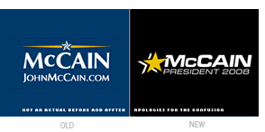
    optima-Mccain


    Update, 06.18.2008: It has been brought to my attention that The Spalding Group’s McCainStore.com “is not authorized by any candidate or candidate’s committee,” and that the merchandise sold is representative of their own version of Sen. John McCain’s campaign logo (and not the official one). I had received an e-mail announcing the new store the day after John McCain’s interview on ABC, and I made the assumption (in part based on a visit to the company web site) that the campaign had indeed updated its brand. I apologize for any confusion that this may have caused.
    — Ryan Hembree


    Now that the dust has settled on the Democratic Presidential Primaries, the general election for the office of President of the United States has finally begun. Senator Barack Obama, with his populist message of hope and change for America, will challenge Republican senator John McCain for America’s vote. Between now and November, signs, banners and billboards will proliferate across the land, from shop windows to front lawns, pitting neighbors, families and friends against one another as politics take center stage.


    In terms of branding, Obama has a clear advantage over McCain. His iconic “sunrise within an O” mark is symbolic of hope and the dawn of a new day in politics. Until recently, McCain’s brand, while more conservative in execution, was very appropriate to the candidate’s background, drawing inspiration from a naval officer’s uniform. McCain himself admitted during a recent interview with Charlie Gibson on ABC’s World News Tonight that he has a “brand issue” to contend with and, because of it, is clearly the underdog.


    In response to this admission, the McCain campaign has launched a new identity, one that we can assume is meant to help improve his image with younger voters and Independents, two demographics that will make a difference in this year’s election. One of the biggest issues each candidate is campaigning for or against is the war in Iraq, which has become quite unpopular among constituents. It seems that McCain’s new brand is meant to downplay the aspects of his military background, as well as the idea that he would continue the “war mongering” policies of President Bush.


    Motivation for the brand revision aside, it is interesting to note the differences between the graphic qualities of the old and new brand that make it, in my opinion, more generic and much less effective for the candidate. The new McCain identity was developed by The Spalding Group, a firm that has designed campaign identities for the past six Republican presidential candidates. As such, it falls back on the conventions of “politics as usual” by incorporating a single, flattened star with drop shadow as the brand’s logomark (not a very unique solution). This star appears in varying sizes depending on application, sometimes overshadowing the candidate’s name, and contrasts with the old, dimensional star that looked as if it came right off of a general’s uniform.


    Eurostile is used as the logotype (along with a fake small cap for the “Mc”), apparently to make it look more progressive or innovative — and, as designers know, Optima is not a popular choice. And while the white and yellow on a color background color scheme has been maintained, it is not used in all applications, falling victim to the patriotic red, white, and blue color scheme preferred by every politician running for elected office.


    Will this new, “improved” campaign identity for John McCain help him connect with the younger, more sophisticated voters that he needs to win the White House this November? Or will this new brand that downplays his military background and conservatism be seen as an attempt to manipulate voters? Only time will tell.


    —Ryan Hembree, principal/creative director (originally posted on Underconsideration.com/BrandNew)