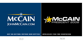
Update, 06.18.2008: It has been brought to my attention that The Spalding Group’s McCainStore.com “is not authorized by any candidate or candidate’s committee,” and that the merchandise sold is representative of their own version of Sen. John McCain’s campaign logo (and not the official one). I had received an e-mail announcing the new store the day after John McCain’s interview on ABC, and I made the assumption (in part based on a visit to the company web site) that the campaign had indeed updated its brand. I apologize for any confusion that this may have caused.
— Ryan Hembree
Now that the dust has settled on the Democratic Presidential Primaries, the general election for the office of President of the United States has finally begun. Senator Barack Obama, with his populist message of hope and change for America, will challenge Republican senator John McCain for America’s vote. Between now and November, signs, banners and billboards will proliferate across the land, from shop windows to front lawns, pitting neighbors, families and friends against one another as politics take center stage.
In terms of branding, Obama has a clear advantage over McCain. His iconic “sunrise within an O” mark is symbolic of hope and the dawn of a new day in politics. Until recently, McCain’s brand, while more conservative in execution, was very appropriate to the candidate’s background, drawing inspiration from a naval officer’s uniform. McCain himself admitted during a recent interview with Charlie Gibson on ABC’s World News Tonight that he has a “brand issue” to contend with and, because of it, is clearly the underdog.
In response to this admission, the McCain campaign has launched a new identity, one that we can assume is meant to help improve his image with younger voters and Independents, two demographics that will make a difference in this year’s election. One of the biggest issues each candidate is campaigning for or against is the war in Iraq, which has become quite unpopular among constituents. It seems that McCain’s new brand is meant to downplay the aspects of his military background, as well as the idea that he would continue the “war mongering” policies of President Bush.
Motivation for the brand revision aside, it is interesting to note the differences between the graphic qualities of the old and new brand that make it, in my opinion, more generic and much less effective for the candidate. The new McCain identity was developed by The Spalding Group, a firm that has designed campaign identities for the past six Republican presidential candidates. As such, it falls back on the conventions of “politics as usual” by incorporating a single, flattened star with drop shadow as the brand’s logomark (not a very unique solution). This star appears in varying sizes depending on application, sometimes overshadowing the candidate’s name, and contrasts with the old, dimensional star that looked as if it came right off of a general’s uniform.
Eurostile is used as the logotype (along with a fake small cap for the “Mc”), apparently to make it look more progressive or innovative — and, as designers know, Optima is not a popular choice. And while the white and yellow on a color background color scheme has been maintained, it is not used in all applications, falling victim to the patriotic red, white, and blue color scheme preferred by every politician running for elected office.
Will this new, “improved” campaign identity for John McCain help him connect with the younger, more sophisticated voters that he needs to win the White House this November? Or will this new brand that downplays his military background and conservatism be seen as an attempt to manipulate voters? Only time will tell.
—Ryan Hembree, principal/creative director (originally posted on Underconsideration.com/BrandNew)