Blog

  • Captain D’s reelin’ it in

    captaind


    Just yesterday, while rifling through my daily pile of junk mail and local ads, I briefly paused at one flyer. I saw fish and rice, hushpuppies and even some grilled skewers of shrimp but could not determine what restaurant was being advertised. Upon closer examination I saw an unrecognizable logo advertising a company I was quite familiar with: Captain D’s. While I’m not a fan of fried fish, I’ve always been familiar with the logo. In fact, any member of my family could spot it mounted on a steel pole from any highway in the country. My curiosity piqued regarding this new logo and I wondered if Captain D’s was perhaps re-branding their entire chain, so I did a little research.


    In August 2007, Captain D’s revealed their new brand. No longer marketing a kitschy fast food restaurant using bold colors like red and blue, D’s is now moving in a different direction altogether. With changes to the menu (additions of grilled seafood and pasta), a remodeling of their restaurants (now decorated with sophisticated graphics and beautiful hardwood floors) and the new look of D’s printed materials and website, it’s no wonder a completely different logo was implemented.


    The logo itself is a successful tie in with the new brand experience. The subtle orange and light blue are uncharacteristic of fast food, and lend themselves to suggesting a finer seafood restaurant. This aligns exactly with the new changes made franchise-wide. The silhouetted fish hovers at the center of the mark, leaving no question as to what food is being offered at this business, while the older mark was far more ambiguous. Also, the words “seafood kitchen” are placed right below the fish, giving the restaurant a more sophisticated appeal.


    The only real drawback to this new logo is a lack of a visual enclosure of the mark, something to separate it from the background. With a box insinuated from the squared edges of the blue waves and white, negative space defining the top corners, I feel the elements of the mark are a bit floaty. This was particularly obvious when I scanned the ad—each coupon seemed a bit cluttered and the logo was indistinguishable from other visual elements.


    With an admitted dislike for fried fish, my new interest in the“Seafood Kitchen” could most likely be attributed to my attraction to the neutralized colors of the new brand and love of hardwood floors. And, between the new menu items at Captain D’s and the overall feel of the franchise, this restaurant may find themselves serving me more frequently.


    By: Kelly Campbell, designer

  • Goodwrench

    Goodwrench


    As a young, female car owner, I find myself often lost in the mess of my machine’s inner mechanism and in the vastly growing market of car products. I don’t know much about how my car runs, why things go awry or why I need my air filter replaced after every oil change; what I do know is that it always costs me a lot to maintain my car. And when high-prices are the case, (and they are, more often than not) I like to know where my money is going.


    Since the 70’s, GM Goodwrench has stood for honest, no-jargon mechanics sure to get your car back on the road in no time. The old Goodwrench logo was a classic mark; set in Futura, it was sturdy, heavy, and sharp. It communicated a certain weight reserved for bulky metal instruments and power tools (see: DeWalt, Stanley, Bosch), but as technologies advance—and cars fall under such a category—a new look is in order for this company.


    Mimicking the ubiquitous power button, Goodwrench’s new icon looks to the future of cars, and anticipates its close relationship to computers. The mark’s glossy effect adds to this, but also emulates its predecessor, the GM block. The logotype’s new, and slightly modified, letterforms (particularly those with bowls, like the “G”, “o”, “d”, and “e”) have discarded Futura’s geometric limitations, and have transformed into something stronger, more advanced. Previously, the “e” had served as a relief from the monotonous letterforms, supplying a little bit of personality in the cold sans serif bunch; Now the slanted “e” has been carried over for traditional reasons, as it is identifiable for the brand (its the little things that count!).


    The new Goodwrench brand doesn’t stop with their identity, as is evident in a series of new television commercials that feature a “Web 2.0” reference. Mirroring the look and feel of most Apple products, everything appears on a muted color background with a mirror-like effect beneath it and takes note of new icons for “Tires”, “Oil”, and “Repairs.” It’s like watching a website in motion: clean, user-friendly, and information-rich.


    The computer-related brand evolution is an interesting and smart move for GM. Not many other auto care providers have taken this forward approach (i.e. Midas, Firestone, Meineke, etc.). Goodwrench is presenting the internal combustion engine as more than an archaic device—one that hasn’t changed since 1905—and is giving us a glimpse of the future of the auto industry. Finally, it just makes sense if you’re going to sell luxury cars as fine-tuned machinery, that you would have mechanics to match the description.


    By the time cars become more like computers, I’ll know even less about mine. Even so, I know I can rely on Goodwrench to fix it—especially with an identity like this one.


    By: Ashley Allen, designer

  • Walmart’s logo refresh safe or smart?

    Walmart Logo, Old and New


    Walmart recently unveiled their new logo sporting a hyphen-less, one word logotype with smooth, round letterforms and a yellow asterisk. This may go unnoticed to the casual viewer, but some are wondering, why the change? Walmart will most likely be spending millions of dollars to change store signage and truck graphics over the next several years, and all for a simple logo change?


    At first glance, the new logo may seem boring and intentionally safe, exactly what one would expect from a powerhouse, mega-company trying to soften their image. In comparison, the previous logo was stamped with patriotism; a red, white and blue palette with a star to replace the hyphen. The updated logotype has been set in lowercase, rounded, and the colors have been toned down to a gentler blue and marigold.


    These particular changes may go unnoticed by some, but it will be hard to not notice that their local store has taken a step toward the “softer side”. This can be interpreted as an attempt by Walmart to let the public know that they are “going green”, which in fact, they are trying to do (I can’t help but be impressed by the company’s efforts to reduce energy use, maximize fuel efficiency in their trucks, and reduce packaging.) The logo may look generic or safe, but in some ways, Walmart is exercising clever tactics by employing the typical “green marketing” attributes like rounded letterforms and natural colors. They recognize the style of current product packaging and labels, such as those found in the natural food market, and are taking advantage of those trends to influence prospective customers.


    While average customers may notice the new logo, or at least its resemblance to an organic food product label, the modified mark will most likely not deter them from shopping at Walmart. However, it may influence prospective customers to visit the store after seeing the softer, cleaner, friendlier brand. If, in fact, Walmart understands that the majority of the public will interpret the new logo in this manner, the refresh would be quite intelligent.


    Overall, I feel the previous mark was not the strongest, most successful logo, but it had a strong recognition value. It said, “We are Walmart, we’re huge and we know it.” Throw that star in there, and it says “Yep, we love America just like you.” The new warm and fuzzy sunshine logo will obviously become well known because of the establishment behind it, but looks like it could be found for sale on a logo creation web site for cheap. Don’t get me wrong, I believe Walmart may have made an intelligent move by taking the safe route: a generic logo that is in line with current trends; but I do think the new logo could be drastically improved by removing the tacky sun/asterisk/flower element, allowing the logotype to do the talking.


    By: Neil Ryan, designer

  • Family Leisure (a.k.a. Watson’s)

    Family Leisure Logo


    This past February, Watson’s, the largest leisure product retailer in the United States (according to the company’s web site) launched a re-brand to reflect the changing focus of their products and service by becoming the Family Leisure brand—“Where fun and family come together!” Since the company sells more than pools, spas and tanning beds, (including pool tables, game tables, bar stools, bars, and patio furniture), the new name is meant to suggest an expanding line of leisure products. However, not only is the new name overly generic and uninspiring, it seems entirely unnecessary.


    Over the last 15 years, Watson’s had built valuable brand equity through its distinct, albeit annoying, television commercials. Featuring Jennifer “the Watson’s Girl” Foley and her step-father as spokespeople for the brand, the immediately recognizable and highly memorable spots always closed with the tagline “That’s Watson’s!” The old Watson’s brand was simple, unique and memorable, consisting of a hand-rendered script set beside a “W” within a red circle. The new brand, “Family Leisure” is set in Cooper Black type, a font that was over-used on packaged goods in the late 1970s and 80s, and immediately dates the mark. It is neither forward-thinking or nostalgic in execution.


    Consistency is lacking in the launch of the new brand, and the messages that are being communicated are contradictory: in explaining the name change, the website touts that the products it sells are for a “family-focused leisure lifestyle,” yet a few paragraphs later describes the company as “a toy store for adults.” When I think of an adult toy store, I think of something entirely different than a wholesome family environment. Additionally, not all Watson’s stores have transitioned to the new brand, and there are still two web domains users can go to online, Watsons.com and FamilyLeisure.com. Both utilize the same cold and impersonal look and feel. In some cases, the red “W” mark is used with the new store name (as seen in this 4th of July promotion).


    So what should Watson’s have done to help communicate the shifting focus of their product line? What was needed was more of an evolution of their existing brand, not a complete revolution and name change. Most retail brands change their look every couple of years in order to stay relevant in the minds of consumers. Perhaps a simple change in Watson’s tagline or a revitalized positioning statement would have been a better course of action. Even “Watson’s Family Leisure” would have been a better change to make.


    Only time will tell if the new Family Leisure will be a successful brand, or if it will fade into obscurity. Watson’s was at least memorable and unique. This name change has essentially forced the 40 year-old company to start over in terms of brand equity and customer perception.


    —Ryan Hembree, principal/creative director

  • The inward value of a brand

    When most people think of branding, they instinctively focus on the outward “package” of the brand: the logo, the web site, the marketing collateral (or lack thereof), and the value they provide and impact they make on the target market. In doing so, organizations try to determine the true needs and desires of the customer, perceptions of the brand, and what message is going to resonate.


    There is, however, another key stakeholder of a brand that is equally important yet often ignored— the employee. After all, the salesperson, the cashier, the delivery driver, and the executive of a company all must interact with customers, and therefore all must know the story of the brand if they are to communicate its core values and a consistent message to the outside world. As such, brands are valuable to the internal stakeholders of an organization for the following reasons: they reinforce the company’s purpose, ignite passion in workers, and are a source of pride and overall job satisfaction.


    Brands instill in employees a sense of purpose.


    Organizations will spend countless hours, hold dozens of “brainstorming sessions” and spend thousands of dollars developing “Mission-” or “Vision Statements” that ultimately can become verbal representations of a brand’s essence. Naturally, because of the time and money invested, these companies will plaster these statements anywhere they can, from the home page of the company web site to the back of business cards, and everywhere in between. Unfortunately, they are not meant for external audiences or customers to see; they are relevant in helping to establish a purpose behind the brand by giving employees a reason to care about their work, their employer, and most importantly, the customer.


    Brands ignite passion in employees.


    Everyone wants to feel good about what they do in life, both personally and professionally, and that in some way they are “making a difference” within the world. This is the reason why many people today are flocking to not-for-profits in search of work that is meaningful to them. While most businesses are in business to make money, ultimately a company is trying to fill a market need of some sort, whether that is through a product or service. If implemented correctly, brands have the ability to communicate to employees that their goal is not only to make money, but to make a difference—helping employees get enthusiastic about their organizations and believe in the value they provide. The more they believe in the brand, the more likely they will go above and beyond expectations to help customers, thus furthering a positive perception of the organization within the marketplace.


    Brands are a source of pride for employees.


    Brands that consistently deliver on their promises are remembered and adored. They draw not only more customers to the company (increasing sales and profitability), they also have the ability to attract (and retain) the best and brightest talent to work for and be a part of that organization. On the other hand, employees are embarrassed to admit that they work for a brand or organization that they don’t believe in, such as those that don’t fulfill their obligations, do not value their customers or employees, or are solely focused on “efficiencies” and the bottom line over customer satisfaction. In this case, the best logo, most creative print collateral, or highly functional web site will not be able to save the brand.


    There are many stakeholders to consider when developing your organization’s brand. While it is true that shareholders (i.e. the “bean counters”) demand a return on their investment in the form of increasing revenue and profits, it is important that the organization considers not only the customer’s needs and desires, but those of employees as well. By giving them a sense of purpose, getting them excited about what they do, and keeping them proud of the organization, it is possible to realize the inner value of your brand. After all, happy employees are loyal ones who will champion your brand in front of the consumer.


    —Ryan Hembree, principal/brand strategy

  • Do you know Jack?

    Jack in the Box Brand Update


    Thinking outside the box when it comes to recreating a brand identity is generally a good idea; jumping completely outside the “jack-in-the-box,” especially when it comes to an iconic brand, may not be so strategic or beneficial. That is exactly what happened shortly before the new year, when the west coast-based fast-food franchise Jack in the Box revealed its new identity. With little ties to the original, it seems this brand may be veering too far from the equity they’ve built over the past 58 years.


    The new logo is quite a departure from the old. It features a teetering box with bubbly typography in which letterforms tend to ooze into one another. The new logo contains few elements from the old, only referencing the red box. New elements such as the scripty “Jack” and the detached, futuristic “in the box” clearly take the brand in a new direction. Some argue that the swoosh descended of the “k” resembles a smile…like a clown, perhaps? Or maybe it is meant to resemble a more literal silhouette of the well-known “Jack,” the spherical-head with pointy hat? The a-symmetrical balance of the new logo is also unsettling; I can’t get past the visual awkwardness created by the two-point perspective of the box and flatness of the logotype, along with the disjointed “in the box” tacked on at the bottom. While the dimensional box is an interesting take on the original flat shape, it bears an undeniable resemblance to the lesser-known burger joint, White Castle. Had the brand name not been split up, with “in the box” outside the box, I feel that much of the awkwardness of the new mark could have been resolved.


    Though the new mark itself doesn’t satisfy my visual taste buds, I do like its integration into various applications, including new packaging patterns. The icons used to signify the cow, chicken and fish are a nice, modern touch, and clearly reference the type of meat that each package contains. The bold, saturated colors of the icons are also very appropriate and fitting for fast-food. The fact that the icons themselves have no dimension in relation to the box shapes behind them doesn’t really bother me; the boxes actually read better as abstracted objects rather than more literal ones.


    While I appreciate Jack-in-the-Box’s recognition of brand revitalization, and their attempt to revamp their identity and implement new graphic elements, it seems a simple facelift could have sufficed without overhauling the logo completely. Some have attributed this re-brand to be more in line with that of a toy company or entertainment brand—and I tend to agree; it seems a bit too retro to become a timeless icon for the brand. Regardless of the new logo, nothing will ever be able to change my love for their deep-fried egg rolls and thick, Oreo shakes.


    By: Kelly Campbell, Designer

  • Young, Hip and Bounce

    Bounce Packages Old and New


    Many people might not care about getting a slick, modern-looking box of dryer sheets when shopping…I’m more of a bargain shopper myself. The new identity and Bounce brand packaging however, compelled me to not only think more about my dryer sheets, but to also probe deeper into the redesign of this iconic brand.


    At first glance, I really enjoy the new look and experience very little disconnect between the old, established look that the product has had for years. It has some elements that work quite well, allowing it to stand out from other, orange, competitors on the store shelf, while others leave me questioning whether the re-brand really matters.


    The more I look at the design, the more I think we could easily be examining a rejected chewing gum package that was resurrected to become the new “rock star” of the dryer sheets aisle. For example, the minimalist approach to the package design is quite refreshing—by removing the blue call-out window and charts that used to live on the front of the box, the result is a much cleaner composition.


    Photos and color are used to differentiate between the various types of dryer sheets. I also like the halftone pattern that has replaced the old sunrise motif. I do like that the new product logo is more “bouncy” than that of the original. The lowercase “b” and ligature between the “u” and “n” makes sense, suggesting the swirling path this product travels while in the dryer.


    Both the front panel graphics and type treatments could have more depth to them, as it looks a little flat. Perhaps bringing back the blue outline around the type or adding a drop shadow to the white border would do the trick.


    I am curious about Procter & Gamble’s motivations—was one of the objectives to reach a younger audience? Is that demographic doing more laundry these days, feeling the need to be “cool” while they throw the whites into the dryer? This might explain the new type treatment of the logo. While I understand wanting to be hip when dealing with electronic products or junior wear, perhaps this tactic is too much for the laundry aisle. Overall, however, I think that the new package design is very effective at “bouncing” into shoppers’ field of vision and subsequently off the shelf.


    By: Chad Wagner, designer

  • SyFy: imagining greater opportunities

    SyFy logo


    As a fan of horror and science fiction movies (both good and bad), I find myself flipping to the SciFi Channel often. The cable channel has been very successful over the last 16 years of creating a world of its own, where viewers and fans of the genre can come together and experience original programming such as Battlestar Galactica, Stargate Atlantis, and studio-released sci-fi blockbusters and “B” movies as well. As we approach 2010 (“The Year We Make Contact”) SciFi is on the verge of a rebirth as SyFy. I believe the decision to launch a re-brand is a good one, especially since the organization wants to trademark its brand (due to the ubiquitous nature of the phrase “sci-fi,” the current name is not legally protect-able).


    Looking at the current identity, one thing I will miss is the distinctive planetary mark. I always thought it was well crafted, so much so that whenever I see a silhouette treatment of Saturn, I instantly think of the SciFi Channel. I do like how the type treatment for SyFy is not too far removed from the original logo, as it suggests more of an evolution of the brand instead of a revolution, and that any fears of too much change are unfounded. I have to disagree with some of the bloggers who say the channel is in the midst of an identity crisis. On the contrary, the new tag line “Imagine Greater” is a strong statement that says exactly where they are going…up.


    Based on early press releases, SyFy will keep the color purple as the primary brand color—which is good since I also have associated the color with the channel. I am curious to see if they will expand their accent color palette, since most current promotional spots are rather monotone. As simple and selfish as it sounds, my biggest fear of this re-brand is that SyFy will do away with the weird and quirky TV shorts they play during commercial breaks and in between shows–these shorts are of better production quality than half of the movies that are currently aired.


    From a business sense the SyFy re-brand is a great move. Expanding into other areas while protecting oneself legally is never a bad idea in my playbook. I just hope that SciFi Channel doesn’t forget who got them where they are now… those possessing an “inner geek” like me. Of course, TV does give them a very big platform to beat the new identity into the heads of its fans.


    By: Chad Wagner, web designer / syfy nerd

  • What’s so funny Pepsi?

    Pepsi Brand Update


    If you haven’t seen it on your grocer’s shelves, Pepsi has gone through possibly the largest rebrand of the past year. PepsiCo said it would be spending nearly $1.2 billion over the next three years on significant changes to every aspect of the brand. They will also be updating the Gatorade brand by creating a contemporary identity in which the entire line will be based on the “G” of Gatorade. In addition, Tropicana orange juice, also a PepsiCo product, has revamped their packaging line, but we will save that for another day.


    The main concern of this article will be on the new Pepsi soda logos. If you haven’t seen the logos (Pepsi, Diet Pepsi, Pepsi Max, Mountain Dew) they have undergone a complete renovation. They continue to use the red, white and blue palette of the previous logo, however, the white band has been formed into three different shapes (smiles) to represent the different sodas. When I read about these “smiles” in the report from AdAge.com, the first thing I thought after reading the article was “What smiles?” AdAge stated that a “smile” will characterize the brand Pepsi, while a “grin” is used for Diet Pepsi and a “laugh” is used for Pepsi Max. Even with knowledge of these “smiles”, I still struggle to see them within the marks.


    Although the new logos are a detachment from the previous Pepsi logos we grew up with, I respect that Pepsi is pushing toward simplicity. I feel brands today need to move away from the gaudiness of the 90s and early 2000s. They need to gravitate towards an uncluttered, honest approach to their product which in turn will create brand loyalty. However, the minimalism of the new packaging almost seems effortless and uninspired. Pepsi, Diet Pepsi, and Pepsi Max are based on a series of gradients and a new typeface reminiscent of the seventies. The new elements seem cold and uninviting, instead of cold and delicious. On the other hand, the company has also rebranded Mountain Dew to Mtn. Dew. The new packaging houses a decent type treatment and an interesting illustration of mountains. The white space seems planned and intentional, leading to a successful package. However, the abbreviation seems slightly forced and unnecessary.


    I remember as a child how a new logo of a product was so exciting for me simply because it was NEW. However, it now frustrates me to see so many companies pushing for new identities when the logo itself was not the problem. In my opinion, Pepsi could have done a simple redesign of their packaging without changing the logo with excellent results. Take Coca-Cola for example, who kept the classic “Coca-Cola” script, cleaned it up a bit, and created beautiful new packaging. It is rare to find a secure brand with a heritage these days, which is why so many are disappointed with this refresh. Nevertheless, I feel we will be seeing the old logo again once this trend passes.


    By: Neil Ryan, designer

  • Tagged For Revision

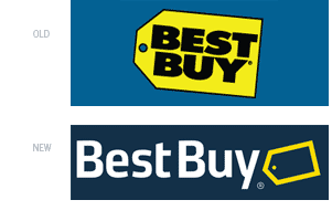
    Best Buy Old and New


    Last August, Best Buy opened a new 45,000 square foot store in the Mall of America. Along with the introduction of the store to the largest mall in North America, and a rockin’ performance by NKOTB (that’s New Kids on the Block for those of you who came of age in the mid-80’s), Best Buy unveiled a more modern and upscale logo. Crisp, clean, and refreshing, the new logo is sure to become as immediately recognizable as its predecessor. This is not to say that it is without flaws, but overall, this is a very nice re-brand for such an iconic store.


    The old logo, in use since 1989, consisted of a giant yellow tag, like those found on clearance, sale, or bargain-priced items. This suggested to shoppers that they were going to get the lowest price and best possible deal on their electronics purchase, and became an icon of the brand itself…it is used to show pricing information throughout the store, as a repeating pattern and texture in print ads and commercials, and is instantly recognizable among all other competing electronics superstores.


    Set in Futura Extra Bold typeface is the company name, nicely contained inside the shape of the yellow tag. Because the logo is a compact unit, it is highly versatile in applications: on buildings it is enlarged to gargantuan proportions over entrances and can be placed on just about any background color or image (although it almost always appears on blue backgrounds—a nice visual tie-in with employee uniforms, which are blue polo shirts and khakis). The only limiting factor to the old Best Buy logo is how small it can be reduced—if shrunk to business card size or smaller, the bold letterforms would fill in (particularly on the newsprint circulars found in Sunday morning newspapers).


    The new logo alleviates some of these reproducibility issues with a slimmer, more modern typeface that now resides to the left of the tag. While removing some of the weight from the logotype was a good thing, too much bulkiness was removed from the yellow tag…it is now too dainty and gets lost as an outline. This is particularly evident when appearing on a white background— simply making the tag all yellow would draw a more immediate connection with the old identity, without diluting the almost twenty years of brand equity that has been established.


    While the new logo does address certain reproducibility issues, it creates new problems as well. For example, the new identity is very horizontal. While this may work in most instances and applications, what happens if a more vertical or square format is required? The tag mark does tuck nicely under the “y”, but how does that translate to a stacked version?


    Overall, the new Best Buy brand is an improvement over the old. The heavy Futura typeface always bothered me, all too similar to and reminiscent of Bed, Bath and Beyond. By separating the logotype from the mark, both elements can be used apart from each other, opening up more graphic possibilities. This is one brand update that I can get attached to.


    —Ryan Hembree, principal/creative director