Blog

  • To know thyself, first know the customer

    In order to know thyself, first know the customer. When developing a brand, it is important to know who your customers are—not just in a general sense, as in their demographics, but more intimately, such as in terms of their aspirations, motivations, and actual behaviors (psychographics). Without this insight, it is impossible to properly position your product or service, or to develop the brand promises that will resonate with the intended audience.


    Knowing your customers seems intuitive and easy enough, but in actuality, knowing what makes them tick (their true desires) is often elusive for a lot of brands. Part of the problem is that companies are so outwardly focused on driving new sales that they neglect cultivating the relationships they currently have, often ignoring or taking for granted the most important stakeholder of the brand, the customer. It is easier for them to find new clients than it is to keep their existing ones happy. Unfortunately, unhappy customers will tell as many people who will listen about their negative experience with your company. Not only will this have a negative impact on the target audience, it will affect the perception of the organization as a whole.


    To discover why customers connect with their brand and how to continue to address their needs and desires, companies should attempt to uncover their most loyal (and thus, most profitable) customers. A common misconception is that organizations should engage in focus groups to answer these questions. The problem with focus groups, according to Robert Brunner and Stewart Emery in their new book, Do You Matter? How Great Design Will Make People Love Your Company (FT Press, 2009), is that companies “will be basing [their] entire business strategy on the fact that 7 people out of a group of 12 expressed a ‘like’ in a certain direction…Mediocrity is what you end up with if you try to make something everybody likes.”


    To find out what those customers really want, it is best to observe them in their natural environment, either using or purchasing your product or service. This is relatively simple if your brand is a retail product sitting on store shelves, but how do you gauge the buying habits, needs and desires of those purchasing a service? In this instance, it is possible to gain valuable insight into your customer’s needs by speaking with them directly, and asking important questions, such as why they chose your company over a competitor, and what the differentiating factors were. Equally important, although sometimes more difficult, is to ask prospective clients or customers that you did not win or lost business to. Why did they choose to work with someone else? Sometimes the answers might surprise you.


    These types of soul-searching questions allow you to better understand the customer’s point of view, affording an opportunity to adjust your brand to be more effective at communicating a more relevant message. Properly positioning your product or service in the mind of your target audience forms an emotional connection with customers that build brand loyalty, reduce marketing costs, and improve profitability. The more you know your customer, the more valuable and measurable your branding efforts become.


    —Ryan Hembree, principal/brand strategy

  • Branding strategies for economic recession

    Cost effective branding strategies for an economic recession. It’s official—as of December 2007 the country has slipped into a recession, and along with it another melancholy mood has descended upon business and consumers. “Belt-tightening” and “budgeting” have been a constant discussion among the media and households as people try to figure out what to do about plunging stock prices, decreased home values, and the prospects of mass-layoffs. The real problem, I would argue, is that the more we hear and talk about a bad economy, the more frightened of it consumers become and the less they will spend on the goods and services that they normally would buy, thus perpetuating the downturn.


    For businesses that are impacted by consumer and business spending (or lack thereof during periods of a recession); or that depend on the free flow of credit, the first instinct they have is to conserve cash by stopping the spending across the board—on hiring, on equipment, on required services or maintenance, and especially on building their brand (through marketing). This is not to say that watching spending within an organization is a bad thing…often tough economic times allow for businesses to re-evaluate their business model and innovate new ways of reducing costs, while providing greater value for their customers.


    Often times, however, the marketing budget is the first to be cut. This can be counter-productive, as it creates a Catch-22 for increasing revenues for a business. Without marketing to create awareness of your brand or promote your products or services, how will consumers know what you offer? Or, if you are not constantly reinforcing your brand’s position with the target audience, it will be easy for the competition to leap-frog you within the marketplace. Companies that continue to market, even during downturns, will be the first to recover once economic conditions improve—doing the opposite will only lead to a decrease in revenue and sales for your organization in the long term.


    Organizations should not stop spending money on marketing during a recession, but instead find cost-effective ways to continue to enhance their brand. One of the most effective (and least expensive) methods is to continue establishing an online presence for the organization, and its products or services. In a previous Re:marks article, we discussed the importance of a web site, so we won’t address that here—the problem is that once a new site has launched, there is very little effort to keep it updated and current, and consequently, visitors stop coming because there is no compelling reason to do so.


    Without visitors or new content being constantly added (at least once per quarter), a web site will fall into obscurity in the minds of consumers and slip in the search engine rankings. There has been much written about the importance of search engine optimization (SEO), but very little in terms of explanation. To put it simply, SEO involves the use of key words (or words that customers might type into a search engine to find information about your product or service) placed strategically within your site; from the homepage description of the organization to the naming of images and pages, SEO is a simple and inexpensive way to increase the likelihood that your site will be found. The more good key words used within a site, the higher it will appear in Google and other search engine rankings.


    Additional Internet marketing strategies can be employed to ensure that traffic will flow freely to your web site. These include: sending out monthly eNewsletters with content that will be relevant to customers (and links them to your web site for more information); promoting events or giveaways through animated “videos” that contain flash animation, music and the ability to forward to a friend (and collect those email addresses into a database of additional prospects); and “pay-for-click” advertising using strategically selected keywords (to increase the chances of customers finding your web site at the top of a search page).


    All of the Internet marketing tactics mentioned above are cost-effective, efficient at increasing awareness of a brand, and help ensure increasing revenue even during tough financial times. For more information on how to realize the full potential of your online marketing, call the branding professionals at Indicia Design.


    —Ryan Hembree, principal/brand strategy

  • Why RC?

    YRC Logo


    Yellow Transportation and Roadway recently joined forces and became YRC Worldwide. With most new ventures, a new logo is needed—hopefully something to communicate the core values of the combined businesses, or be relevant to the type of service that the new business provides. Unfortunately, the new YRC logo appears to have missed the mark on both accounts.


    Representing the marriage of the two companies, the new YRC logo incorporates the Swamp Holly Orange from the old Yellow Corporation, and blue from Roadway. According to YRC, customers will be able to see familiar branding elements once the combined company identity is rolled out. While this is true with the orange and blue color scheme, the “swooshes” that incorporate these colors seem to have no relevance to either the old logo or the new venture. In what might be more relevant as a logo for boomerangs, these do nothing to build on existing brand equity, making the identity feel more whimsical than serious, which can be considered a negative when referring to a professional, multibillion-dollar transportation company. Lose the color “swooshes”, and the remaining gray shape is quite nice, as it evokes reference to the shape of the old Yellow logo.


    The typography might be the greatest downfall of the new YRC logo. Typography in any logo should be legible, leaving no question about the company’s moniker. In this case, the “R” does not read well and the “C” does not match the width of the “Y” or the “R”. All three characters are severely modified and look awkward and clunky. If you asked Fred Flintstone to design a typeface for a corporation, it would look like this—not exactly the professional image a company of this caliber needs.


    I have to wonder if this is an example of corporate bullying: did the executives of YRC push themselves into the lead creative role when developing this new identity? While there should be a balance between the client’s goals and desires for a project, and letting the creative agency utilize their expertise to establish a logo for a company, sometimes this line is compromised, which doesn’t always end in a good solution. If so, this could explain the final solution, which is eerily similar to the Dairy Queen logo. I would expect a better solution from one of the largest transportation service providers in the world.


    Overall, the new logo says very little about transportation or shipping. Maybe the slanted letters are intended to hint toward a forward motion, with the swooshes indicating a start and stop point and a return to the beginning – shipping to and from locations. It seems that more refinement could have been made to show the true nature of the business. In comparison to a similar company, the FedEx logo contains a very clever arrow between the “E” and “X,” which speaks directly about what they do—transport with speed and precision. Unfortunately, the new YRC logo is something that the world has to look at, although it might be well worth the risk to closing your eyes while passing one of their tractor-trailers on the road.


    —Justin Leatherman, senior designer

  • How Brands Add Value, Part II

    In the last installment of “How Brands Add Value,” we discussed the importance of branding, and how it has the potential to create increasing value for a product, service or organization. By telling a compelling story about the quality of a product or service; inspiring customer loyalty through consistent and satisfying offerings; or promoting a certain lifestyle; brands have the ability to create and add real value to an organization. It is important to realize, however, that no matter how relevant these promises are to the target audience, there is another important consideration—how companies position, or “package,” their products or services can also greatly influence the value of a brand.


    There is an ongoing and sometimes intense debate among professionals about how to position their offerings. One school of thought is that if a company provides services, they should try to package them as “products,” as that allows for efficiencies in terms of production and economies of scale. The problem with this approach is that while it is possible to cost-effectively reproduce an organization’s core competencies, it also can “cheapen” the perception of what is provided…products can become perceived as commodities, which ultimately leads to a devaluation of the brand (and more importantly, the price that customers are willing to pay for them).
    Product-Service-Experience


    In the example above, adapted from Joseph Pine and James Gilmore’s The Experience Economy (Harvard Business School Press, 1999), the price customers are willing to pay for a product or service directly correlates to the perception that they have of it. Commodities, such as coffee beans, are generic and considered to be a “dime a dozen.” Maxwell House is similar in smell and taste to many other brands of coffee, and therefore must compete based on price. McCafé is a service found in McDonald’s restaurants that provides gourmet coffee, while the European-style coffee house experience provided by Starbucks allows them to charge US$3 or more for a cup of coffee.


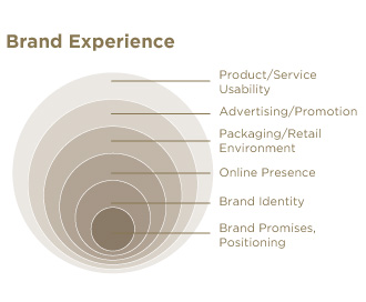
    Instead of trying to position services as products where they would compete on the basis of price, we should package them as memorable experiences—customized transactions in which each customer receives the highest level of service and satisfaction. Developing a brand identity that takes into consideration every interaction that the target audience will have with the brand—from its logomark and packaging; to marketing collateral and advertising; to web site functionality; to the retail/physical environment that it resides in; to the actual usability of the product or service; are all important factors that make up a Brand Experience.

    Brand_Experience


    Organizations that take this holistic approach to branding, by taking into account all of the ways in which customers interact with a product or service, and are able to create a unique, memorable experience through consistent and relevant brand promises, will achieve ultimate differentiation in the marketplace. In turn, the company will retain a valuable position at the forefront of customers’ minds, commanding a premium perception and price, and allowing for greater profitability. What’s more, the organization will have created a true competitive advantage that will be difficult, if not impossible, for the competition to replicate.


    —Ryan Hembree, principal/brand strategy
  • Speak of the Devil

    Tampa Bay Devil Rays Logo


    As we near the end of 2008, we look back on some of the brands that have taken shape. As a designer, it’s sometimes easy to make a snap judgment about a new brand identity shortly after its introduction, without giving it time to resonate with the audience. In this issue of re:marks, we look back at a brand that has had a year, or at least an entire season, in the market.


    Major league baseball has always been an American tradition and a venue continually providing family-friendly fun. This fact must have, to some degree, impacted the Tampa Bay Rays’ move away from “Devil Rays,” and into a new brand focused on the best the state of Florida has to offer: sunshine. No doubt “devil” can be a good thing, especially when one speaks of eggs, but the franchise has more than struggled until 2008, spending much of their time in the AL East cellar. All that changed this past season when the new brand hit that stands and fans seemed more than accepting.


    The new brand for The Rays is not a complete departure from the old, yet the use of the homonym for congruence seems a bit of a stretch. A vicious devil ray is not easily translated into a soft beam of light, and while there may be a subtle reference to a devil ray’s tail in the “R” extender, there seems to be more of a disconnect than a merger of identities. Similarities between the brands can also be seen in the color selection, namely the navy blue. However, the new logo ushered in several changes from its original form, the least of which is the use of a serif typeface and more obviously, the kitschy baseball diamond.


    The Rays showcased not only a new brand this past season, but also a new team, in many respects. With better pitching and defense, a shot at the World Series didn’t seem like a complete fluke; a promising lineup paired with a new brand had the potential to be a winning combination. While it’s hard to rationalize an ALCS pennant due to a new logo, it’s undeniable that a new brand can do wonders for any company, even a down-and-out sports team. And while re-designing a franchise identity can be risky (costing lots of money), much money can be made from a good brand. In this respect, the Rays new brand can be considered successful—merchandise sales were up this year throughout MLB, but considerably more for the Rays. The conclusion one could draw is that the new brand is better than the old but not necessarily good design. The push for the new brand has even gone so far as to the Rays ownership issuing $1 fines to media members found using the former Devil Rays name (which reportedly goes to a Rays’ sponsored charity).


    It will be interesting to see how the Rays continue to build on the brand they’ve established. With a generic typeface and lack of a fierce representative team mascot (it is unclear what animal would relate to rays of sun), the Rays may need yet another new identity in the near future. Perhaps the Rays can find a way to capitalize on their growing fan-base and unique geographical location to establish a relevant brand that will catapult the franchise into extra innings.


    By: Kelly Campbell, designer

  • How Brands Add Value, Part I

    When approaching the sometimes overwhelming and perplexing task of “branding,” most companies are cautiously optimistic and therefore very hesitant to pull the trigger on major initiatives such as a launch or re-brand. After all, branding is a major investment of both time and resources for what might seem like an intangible product or service. How does the client know that they are really getting a return on their investment? Do brands really add value to the organization?


    Advertising agencies, brand consultants, marketers, or graphic designers will sometimes give differing opinions and definitions of what a “brand” is, and how it helps build audience perception, and therefore value, about a product, service, or organization. The problem for a prospective client is that depending on whom you ask, each response might be skewed in favor of increasing the chances of that particular creative firm winning the work.


    The truth of the matter is that brands are more than simply intriguing or eye-catching advertisements, a great logo and package, or highly targeted and consistent messaging. This is not to say that these things are unimportant or irrelevant—when used on their own, each of these tactics can help enhance a brand’s image. However, the key to effectively building and maintaining a brand is to tell a compelling story about the company, its products, or services. In doing so, brands promise to provide customers with an experience that increases their perception of quality, increases their loyalty to the brand, and promotes a particular lifestyle.


    An effective brand that communicates the essence of quality will give customers the perception that the product or service is better than that of the competition.

    Since it is perceived to be of higher quality, these brands will command higher prices, adding more revenue to the bottom line. For example, there really is not a lot of difference between a cup of Dunkin’ Donuts coffee and Starbucks’ regular blend. Both are made of the highest quality coffee beans, are grown in roughly the same geographic area, and according to taste tests, have the same flavor. Then why is it that a cup of Starbucks coffee costs a dollar or so more than the cup from Dunkin’ Donuts? In this case, the quality conveyed by the Starbucks name and logo on the cup has added real monetary value to the company in terms of higher profits per cup of java.


    Brands that perform consistently in delivering on their promise of quality increase customer loyalty.

    A satisfied customer will tell three of their friends about their experience with the brand, while an unhappy one will tell as many people that will listen. While it is true that it is easy to go out and find new customers, an organization will see a higher return on their investment by consistently meeting or exceeding customer’s expectations, thus reinforcing brand loyalty and keeping the customers they already have.


    Loyal customers buy brands because they promote a certain lifestyle or image.

    No matter how individualistic or different a person tries to be, it is only human nature to desire to be part of a group, to “belong” to something. Brands convey to others that a person has achieved a certain amount of success, or more often than not, that he or she desires to attain that lifestyle. Products or services that deliver on this particular promise connote a higher level of quality or are perceived to be luxurious—as a result, organizations may charge more for those brands. When it comes to automobiles, BMW, Mercedes and Volvo are perceived as luxury vehicles and command a premium price.


    Brand promises must be relevant to and address the needs and desires of the target audience or customer.

    By promising quality, consistency, and image, branding has the power to add increased value and profits to companies. It is important, however, that organizations deliver on the promises that they make, and in every interaction with the customer. Failure to do so dilutes the value of a product or service, as we will discuss in the next installment.


    —Ryan Hembree, principal/brand strategy

  • Who to trust with your brand?

    Who to trust with your brand: an agency of record or a creative partner? Building an engaging brand experience is sometimes a Herculean task, one that takes months, even years, to complete. Even after a brand has been established, it must continually evolve to stay relevant with its target audience. Therefore, it is vital that a company selects and works with a creative organization that truly understands (or desires to understand) their product or service, and that will provide continuity in terms of overall quality and level of service. Graphic designers, marketing and public relations firms, and advertising agencies all claim to be experts in “branding.” While true that these different types of creative organizations are capable of handling a brand project, what clients really need is a creative partner.


    The word “agency,” often used to describe some advertising or PR firms, brings to mind comparisons with law firms or accountants—not only are these service providers treated like commodities, they are notorious for fee-based work in which the primary motivation is that “time is money.” They charge for every minute they speak to or perform work on behalf of a client; call an attorney to ask a simple question, get a bill for fifteen minutes of their time. Some advertising agencies, those with large overhead and payroll liabilities, find themselves operating this way out of necessity.


    Creative firms should focus on building relationships, not billable time.

    There is a difference between creative companies that bill hourly and those that bill per project. In fee-based agencies, where becoming the “Agency of Record” for a client is the ultimate goal, the primary focus is on winning new business, getting a signed contract over a specific amount of time (a “retainer agreement”), and then moving on to the next prospect. The client commits to paying an up-front fee for a certain number of hours per month (regardless of whether or not all hours are expended); projects are assigned to junior staff members (senior staff is focused on acquiring new clients); and projects tend to progress more slowly (since there are only a certain number of billable hours available each month). Ultimately, this can be a one-way relationship in which the client is left under-served and unsatisfied.


    Firms that focus on becoming a “Creative Partner,” however, are not out for short-term gain, but rather to develop a long-term relationship with the client. Branding is a process that takes time to implement, and it is important to have a consistent team—by collaborating with a company’s sales or marketing team, the creative partner begins to understand their needs, target markets, and ensures that a creative strategy is built around the client’s business goals or marketing strategy. Any billable time is built into a project rate that is agreed to up front, and adhered to. In lieu of a monthly retainer (that might become open-ended), the Creative Partner will propose a clearly defined, phased approach to the branding problem, establishing a schedule of projects to be billed as they are completed. If and when a dispute between the partners arises, they work to resolve it quickly and fairly, and use that knowledge to further the relationship. In this manner, a mutually beneficial relationship is established.


    Whatever type of project the client needs, a creative firm should not have a mentality revolving around the billable hour, which in effect nickel-and-dimes the client. True creative partners must be willing to do whatever it takes (within reason, of course) to make sure that the client is taken care of and satisfied with the quality of service and work that they receive. Now that’s a good brand experience.


    —Ryan Hembree, principal/brand strategy

  • The new entry point to your brand

    It used to be that all one needed to succeed in sales was a great smile, a firm handshake, and an impressive business card. If a person had these three attributes, they were pretty much guaranteed an audience in which to pitch their product or service. This personal interaction allowed for questions to be asked, concerns to be addressed, and a certain level of trust to be established between the consumer and salesperson—the very essence of branding.


    Unfortunately, in today’s highly competitive marketplace, building brands through a charming personality and great looking business cards is not enough—consumers have been inundated with marketing and advertising messages, a seemingly endless selection of products to choose from, and increasing demands for their time. Therefore, a well-designed logo or brand is no longer enough. More and more, people are turning to the web in order to make purchasing decisions.


    The Internet offers a pressure-free environment in which consumers can explore a company’s products or services at their leisure, and without eager salespeople trying to close a deal. A well-designed web site allows companies to communicate their brand essence—the qualities, benefits and value that resonates with their target audience. Regular email communication and promotions, as well as community forums, allow for the organization to create an emotional connection with consumers. In this capacity, the web has truly become the entry point for the brand experience.


    Even though online communications are becoming essential to business success, this does not necessarily make printed collateral, such as brochures, sales kits, or direct mail pieces, obsolete. In fact, this is quite the contrary. Any type of Internet marketing effort, whether it is an informational site (referred to as an “online brochure” or “static site”), an email marketing campaign, or an electronic newsletter, must still be supported through traditional marketing and promotional activities.


    Brands are more than just an organization’s logo, brochure, or even a web site. The brand experience encompasses all aspects of communication between a company and its target market or audience. Therefore, it is important that all touch points associated with your brand must have a professional look and feel, and communicate a consistent message. It just so happens that now the most important first impression is your company’s web site.


    —Ryan Hembree, principal/brand strategy

  • Meet the Bread Man from Down Under

    Atlanta Bread Co.


    Atlanta Bread Co., hailing from, you guessed it, suburban Atlanta, is a casual bakery-café franchise offering fresh, quality food fast. Originally started as a small sandwich shop in 1993, the company has since franchised into approximately 100 locations in 24 states. As they have expanded, Atlanta Bread has not only enhanced the retail experience of their cafés, but updated their brand identity as well — a process they have been slowly rolling out over the past few months, here is an early look at the change.


    The old Atlanta Bread logo was a very heavy mark consisting of detailed wheat stalks (indicative of both bread and baked goods) rendered on a black background, with a roughened yellow border frame that divided it into two, almost equal halves. The typeface, American Typewriter Condensed, was clunky, set in all caps, and looked dated (even when it first came out). These criticisms aside, the old Atlanta Bread logo projected a handmade quality that was appropriate for the audience and the type of establishment that it is, and all within a nicely contained, immediately recognizable mark.


    There were, no doubt, certain reproduction challenges due to the level of detail of the old Atlanta Bread Co. brand, particularly in smaller sizes, or in embroidery applications on employee uniforms. Perhaps in response to these issues, the company decided to implement a much simpler identity for the brand, as evidenced by their recently adopted “Bread Man” logo.


    Consisting of an abstracted, asymmetrical figure embracing a circular “bowl,” this new identity looks like it is straight out of an aboriginal cave painting, and more appropriate for an Outback Steakhouse. In fact, it reminds me of the Sydney 2000 Olympic Games logo. According to the company web site, the Bread Man “represents the heart and soul of Atlanta Bread… part global traveler, part old school baker and part next door neighbor.”


    OK, the “global” part I get… as I mention above, this seems very “Aussie” to me. The “old school baker” is a bit more of a stretch, unless that circular shape is supposed to be a bread bowl. And I certainly don’t see the “next door neighbor” in the new mark, unless you are supposed to get that impression from the personable feel of the new logotype. The casual, handwritten script is certainly an improvement over the old brand’s typewriter characteristics, and the burgundy and olive green color scheme is very nice.


    In my opinion, Atlanta Bread’s new brand has been heavily influenced by Panera Bread, their largest competitor. Panera’s brand (shown above, which has been in use for several years) features an abstracted person holding a loaf of bread. A similar type treatment, with almost identical typefaces, has been used. And if you compare the retail environments of both restaurants, you will see similar color schemes, patterns, and graphic elements. It seems to me that Atlanta Bread was too busy trying to emulate and become the alternative to Panera Bread, that they simply implemented an identity that has very little, if anything, to do with the organization’s roots.


    —Ryan Hembree, principal/creative director (originally posted on Underconsideration.com/BrandNew)

  • Optima Won’t be Running for President

    optima-Mccain


    Update, 06.18.2008: It has been brought to my attention that The Spalding Group’s McCainStore.com “is not authorized by any candidate or candidate’s committee,” and that the merchandise sold is representative of their own version of Sen. John McCain’s campaign logo (and not the official one). I had received an e-mail announcing the new store the day after John McCain’s interview on ABC, and I made the assumption (in part based on a visit to the company web site) that the campaign had indeed updated its brand. I apologize for any confusion that this may have caused.
    — Ryan Hembree


    Now that the dust has settled on the Democratic Presidential Primaries, the general election for the office of President of the United States has finally begun. Senator Barack Obama, with his populist message of hope and change for America, will challenge Republican senator John McCain for America’s vote. Between now and November, signs, banners and billboards will proliferate across the land, from shop windows to front lawns, pitting neighbors, families and friends against one another as politics take center stage.


    In terms of branding, Obama has a clear advantage over McCain. His iconic “sunrise within an O” mark is symbolic of hope and the dawn of a new day in politics. Until recently, McCain’s brand, while more conservative in execution, was very appropriate to the candidate’s background, drawing inspiration from a naval officer’s uniform. McCain himself admitted during a recent interview with Charlie Gibson on ABC’s World News Tonight that he has a “brand issue” to contend with and, because of it, is clearly the underdog.


    In response to this admission, the McCain campaign has launched a new identity, one that we can assume is meant to help improve his image with younger voters and Independents, two demographics that will make a difference in this year’s election. One of the biggest issues each candidate is campaigning for or against is the war in Iraq, which has become quite unpopular among constituents. It seems that McCain’s new brand is meant to downplay the aspects of his military background, as well as the idea that he would continue the “war mongering” policies of President Bush.


    Motivation for the brand revision aside, it is interesting to note the differences between the graphic qualities of the old and new brand that make it, in my opinion, more generic and much less effective for the candidate. The new McCain identity was developed by The Spalding Group, a firm that has designed campaign identities for the past six Republican presidential candidates. As such, it falls back on the conventions of “politics as usual” by incorporating a single, flattened star with drop shadow as the brand’s logomark (not a very unique solution). This star appears in varying sizes depending on application, sometimes overshadowing the candidate’s name, and contrasts with the old, dimensional star that looked as if it came right off of a general’s uniform.


    Eurostile is used as the logotype (along with a fake small cap for the “Mc”), apparently to make it look more progressive or innovative — and, as designers know, Optima is not a popular choice. And while the white and yellow on a color background color scheme has been maintained, it is not used in all applications, falling victim to the patriotic red, white, and blue color scheme preferred by every politician running for elected office.


    Will this new, “improved” campaign identity for John McCain help him connect with the younger, more sophisticated voters that he needs to win the White House this November? Or will this new brand that downplays his military background and conservatism be seen as an attempt to manipulate voters? Only time will tell.


    —Ryan Hembree, principal/creative director (originally posted on Underconsideration.com/BrandNew)