Blog

  • Stanley’s Renovation

    stanley logos


    As someone who frequents the hardware store, walking through the aisles of tools and gadgets making imaginary wish lists, Stanley has become a part of my DIY vocabulary. Established in 1857, Stanley has withstood the test of time by evolving with the industry, continuing to produce quality products. Recently, the brand merged with Black & Decker, creating Stanley Black & Decker. This has carried them in to a new realm, from Healthcare and Security products to Engineered Fastening and Oil Pipeline Services. As any S&P 500 company would do in this situation, they decided to update their branding.


    Partnering with Lippincott, a global brand strategy and design firm, Stanley worked extensively with all touch points of the brand to preserve its essence. Keeping the signature black and yellow color palette, Lippincott freed the Stanley logotype from the black badge-shaped enclosure, instantly modernizing the logo. Changing the typeface from stout and bold to slightly taller and less heavy was another choice that seemed to update the look. The “N” is cut diagonally, leaving a right triangle pointing upwards. At first look, I think of a square tool, communicating a theme of precision.


    In their press release, Stanley describes the arrow as representing “action”, which seems to have been chosen directly from a generic word library for logo meanings. I’ll give them the benefit of the doubt and stick with the square tool idea. Besides the “N,” there is the incredibly strange “S” at the front of Stanley. The awkwardly angled end, or terminal, of the “S” runs directly in to a perfectly square bar on the “T.” This detracts from the intention of the precise arrow. It may be nit-picky, but in contrast to the previous “S,” which curved around to end parallel to the baseline, the new “S” seems like a mistake. I don’t love it, but all in all, I can live with wonky “S” and appreciate the reminder to measure twice, and cut once.


    stanley_2stanley_3


    Next, Stanley has revamped all of their packaging to include the new look. The products have a strong look with the clean, new logotype applied. However, the actual packaging uses the logo so large that it starts to seem more like a generic “house” brand of a chain store. In my opinion, using the logotype smaller, left-aligned on the packaging could give it a more premium feel. Large and centered seems cheaper than the Stanley name deserves. It may take until the final product reaches the shelves to get a good impression of the new packaging, but for now, I will have to hope that the design gets a few updates.


    stanley web stanley_5


    Overall, I applaud Stanley Black & Decker for updating the logo, going for a slightly modernized approach but still keeping things simple. The black and yellow color scheme has become well recognized and will continue to do so. “I believe that this new logo has the strength and power to carry us for decades to come”, said Scott Bannell, Vice President of Corporate Brand Management. This may be correct, especially with Stanley’s history of consistency. The new logotype will look fantastic embossed directly on to metal or printed on Stanley’s tools, as well as on the vast array of products the newly formed corporation will deliver. Until then, I can live with the “S” and generic packaging, and appreciate the presence of fresh design in the hardware store.


    By: Neil Ryan, Art Director


    stanley_6


  • Color You Can Almost Taste (but you probably won’t want to.)

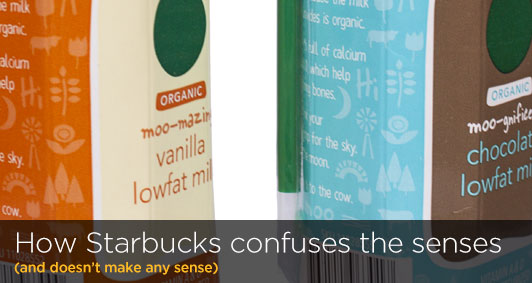
    How Starbucks confuses the senses


    In early July, Starbucks introduced newly repackaged organic boxed milk in its stores. The old Horizons brand with its leaping cow, has been replaced by a Starbucks design and branded container featuring bold colors, simple graphics, and the iconic green straw.


    The new Starbucks milk containers side by side


    The new Starbucks milk packaging is simple yet whimsical, with a flood of bold color and subtle pattern of farm-related symbols. A large, old-fashioned milk bottle appears on the front, with a green circle (a simplified Starbucks logo?) and a playful attempt at naming the product: “moo-gnificent chocolate” and “moo-mazing vanilla.” The brand story appears on the side in a hand-written typeface. Overall, the design of these packages is well done. The problem, and what is most disconcerting, is the choice of colors used goes against all conventional wisdom (and proven research) regarding brand packaging, making the product a lot less appealing, and appetizing, to buy.


    The new milk cartons give off the wrong first impression.

    A product’s packaging is often the first interaction that a customer will have with a retail brand. According to a study commissioned by MeadWestvaco (Packaging Matters: Packaging Satisfaction Study), “when it comes to making purchasing decisions, the average consumer ranks a product’s packaging almost as important as [the reputation of] the brand itself (ten percent versus 12 percent).” In the case of Starbucks’ organic milk packages, they don’t look like milk cartons—the bright orange makes it look like it’s orange juice, while the blue box is reminiscent of blueberry or raspberries.


    Coke Polar Bear Cans

    When Coke introduced their white Polar Bear cans for Christmas 2011 (read more about this), not only did customers have difficulty finding the product on store shelves, they also complained that it tasted more like Diet Coke (presumably because the can looked similar).

    Packaging colors should correspond to flavor.

    Flavorful Color diagram


    Color has the power to affect how we perceive something to taste—which is why it is so important in food and beverage packaging. Common color and flavor associations have been completely disregarded by the Starbucks milk packs–the Vanilla-flavored milk should have used the baby blue carton; instead, the flood of orange makes it look more suitable for orange juice or Tang. And while Starbucks uses a lot of brown throughout its stores and brand, that color would have been much more appropriate for the chocolate milk carton. It is almost as if differentiation instead of communication was the goal of the color schemes.


    So what can be learned from Starbucks’ fruity-looking milk cartons? First, no matter how beautiful a design is, if a package gives off the wrong impression about the brand or product, then it will not resonate with consumers (and possibly hurt sales). Secondly, color should be used for effectively communicating a product’s attributes, not simply as a means to differentiate. Only time will tell if Starbucks customers will find the new packages relevant (or appetizing).


    By: Ryan Hembree, Principal  |  Brand & Creative Strategy


  • Coming Soon to your iDevice: User i[OS]nterface 7

    iOS 6 vs. iOS 7 (side-by-side comparison)


    Get ready for a new feel when you touch your iDevice. Well, not a literal sensory feel, but a visual feel. You’ll still be touching a high-quality glass screen, but what’s underneath is getting a makeover. I’m talking about the iOS 7 icons, Apple’s new iDevice operating system. No more ultra glossy icons to tap; at least after you install the update. Apple is rolling out its new iOS 7 look in the fall of 2013, and this will the first major update since 2007.


    While first getting some criticism for not releasing a new iPhone at the WWDC (Apple Worldwide Developers’ Conference) in June, they did unveil a completely new iOS 7 operating system. Why the update? Apple says, “…Our purpose was to create an experience that was simpler, more useful, and more enjoyable — while building on the things people love about iOS. Ultimately, redesigning the way it works led us to redesign the way it looks.”


    So what’s the difference? What’s new? The most noticeable iOS Phone icon comparisonchange is the gloss-less look (applause sign please). Icons for apps no longer have an overly cheesy, “trying to make 2-D look 3-D” kind of dimensionality. They are now donned with ultra bright colors and subtle gradients. The rounded corners are now more round, and each icon uses a slightly lighter weight typeface (Helvetica of course).


    Do people like it? After all, the masses will be using it. Despite the heckling coming from the haters, most users polled prefer the new iOS 7 icon design to iOS 6. According to Polar, a mobile polling tool built by Input Factory to gauge user opinions, users prefer the new look and feel two to one, with over 46,000 people answering. However, the complaining has not ceased. Some are calling the complete design ‘hideously ugly,’ but I don’t agree.


    In my opinion, the design has been long overdue. I enjoy the brighter colors and flatter look of the icons. It exudes sophistication while also feeling like a consumer device. It’s apparent that more focus is devoted to typography and simplicity, making for a clearer user experience. Are there things I would change? Yes, but they are small: make the corners more square and maybe reduce the saturation of the eye-popping colors.


    iCal in iOS7


    In order to justify the cost of a high-end device that makes calls and does a thousand other tasks, the user experience needs to look sexy and expensive–and that goes further than the encasement. Many users are so used to the previous look that I think for some, the disdain is a knee-jerk reaction. Will the redesign mean a few less sales of iPhones? Perhaps. But I think the redesign will eventually be embraced. After all, Apple is trying to give users something they don’t realize they want, which is not an easy thing to do.


    Sometimes it is necessary to do a little “spring cleaning” and de-clutter, even when you don’t think you do. That’s what Apple has done with iOS 7. In their own words, Apple says they made the new look and feel to “work and look beautifully.” I agree.


    By: Justin Leatherman, Art Director

  • Why is Adobe Scuttling Their Brand? (how customer perception helps your company sink or swim)

    Adobe's Creative Cloud Changes Everything...literally.


    Navigating the waters of brand perception can be tricky, but if done right, customers will remain fiercely loyal to your company’s product or service offerings. This is accomplished by providing positive experiences for your customers. If, however, brands provide inadequate, inauthentic, and unsympathetic customer service, those companies’ perceptions will sink and customers will flee in droves.


    One company that is in very real danger of scuttling their brand is Adobe, an iconic brand that provides software for the creation and editing of content. The vast majority of creative professionals use Adobe’s Creative Suite of products (which includes Photoshop, Illustrator, InDesign, Acrobat, and many more content-creation and sharing products).


    Adobe has been a leader within the creative software space for over a decade, and customers loved their products. It also enjoyed a solid brand perception; that is, until May of this year, when Adobe drastically changed its business model by abandoning traditional software pricing models and moving instead to a subscription based one. Now, customers who rely on the software will find themselves paying more—much more—to keep their software up-to-date.


    For the past ten years, Adobe’s Creative Suite has offered bundled software packages to users for a one-time fee per license, with upgrades priced at a percentage of the full version cost. Each version’s features could be counted on to serve customers’ needs for at least 2–3 years, meaning that it was possible to leap-frog at least one full version of the software before upgrading. With the subscription-based pricing of Creative Cloud (what Adobe is now calling their Creative Suite of products), users will have to pay from $50–$70 per month (that’s $840.00 per year) PER computer. What’s worse, if users stop paying for their subscriptions, they will lose the ability to view, edit, print or export their work. In essence, Adobe is holding users hostage to their products so they will continue to pay for a subscription— indefinitely.

    At Indicia, the subscription for Adobe's CC would be $5,040 per year. Compared with one-time costs of $2,500 per license and upgrades at $500 or so every three years, the new pricing has creative professionals looking for alternatives.

    Adobe’s drastic pricing shift has caused users of their products to question the value of the brand: not only does it appears that the company is trying to increase “shareholder value” at the expense of its customers, they are sending a message of arrogance and mistrust (part of the reason why Adobe wants to verify subscriptions monthly is to decrease or eliminate software piracy) to their customers.


    In turn, creative professionals and users (this one included) are lashing out at the company. In a survey of over 1,600 users conducted by CNET and Jefferies, 76% of respondents using the latest “boxed version” of Creative Suite (6.0) indicated that they would “never” move to the subscription-based Creative Cloud. Users of earlier versions said they were strongly disinclined to move to the subscription model as well. The lesson Adobe should learn from these types of surveys is that customer loyalty must be earned; it cannot be forced upon users. In doing so, the company has irreparably damaged its brand perception.


    Ironically, Adobe is facing a similar fate to its old archrival in desktop publishing software that it vanquished in the early 2000s: Quark. Quark Xpress had been the industry standard software for years, but when Apple updated its operating system and the company refused to immediately recode its software to work with the new system, users jumped ship and adopted Adobe InDesign instead; it was this foothold in creative professionals’ toolkits that allowed Adobe to saturate the market and become the leading brand.


    What will end up happening, in this author’s opinion, is that Adobe’s customers will seek cheaper alternatives…there are a plethora of other software choices out there for users to buy, and for a one-time fee. Though other products may not be as comprehensive as Creative Suite—yet—within a couple of years these alternatives may finally drown Adobe’s brand.


    By: Ryan Hembree, Principal | Brand and Creative Strategy

  • How Pinteresting! Popular Social Network Updates Look

    America’s third most popular social network, Pinterest, updated their website this month with a goal of bettering users’ experience and interaction. The new design improvements include a simpler and cleaner layout and an array of new discovery features that make pinning your favorite things quicker and easier than ever before.


    Pinterest Look and Feel

    The Top 5 Social Media Sites


    For those of you still exploring social media and what it means for your brand, Pinterest is an online pinboard, or social bookmarking website that allows users to create, share, and save interests, hobbies and/or events to topic-based collection boards. When a user shares an image or video on Pinterest, they are “pinning” content. Each pin is represented as an image and can be linked back to its original source. Pins can be organized by theme, and on different boards. Users who want to save what others have “pinned” will “repin” that content to save it to their own collection boards. Users also have the option to “follow” other users who share similar tastes and interests.


    Three years after its launch in 2010, Pinterest embarked on a redesign to make the site easier to navigate, without drastically changing its look. After a three-month test period with select members, Pinterest analyzed feedback and began implementing the new site redesign to the rest of its 48-million+ users. As an avid Pinterest user, I was excited try out the new look and features.


    With the redesign, Pinterest is even more user friendly. Navigating around the site is easier and more fluid for users, with pinners and boards featured more prominently than before. The pins are larger, and higher-quality images and feature-related pins make it easier to discover similar things. Suggested search terms, and the ability to view recent searches have been added, as well as a drop down to show popular topics. Pinterest notifies users when they are posting duplicate content, helping to eliminate clutter on their boards. My favorite new feature is that all content shows up on the same page, so you never have to leave it to view content; now I never lose my place while browsing.


    pinterestarticle_photo1


    Pinterest has also made it easier for users to interact with each other and discover material from like-minded individuals. It is now possible to send pins to friends, and even include a personal message. Pinterest users can now find friends from Twitter and Facebook that are also on Pinterest.
    After testing the site, I’ve been very pleased with Pinterest’s updated look and new features. I appreciate that the company is interested in bettering users’ experiences, and takes the time to listen and evaluate their opinions. The new design is very helpful in managing and sharing my continually expanding boards. Pinterest is one of the top places for inspiration on the web and with the redesign it’s an even more beautiful visual experience.


    By: Ashley Faubel, Designer

  • Bringing Clarity to your Brand will clearly help customer perception

    Do people understand what your product or service really is or does, and why it matters? Does your brand compel customers to tell others about the product or service offering you provide? Is there a remarkable story behind it, one that lends itself to retelling through referrals?


    “Your marketing materials and sales presentations must be designed to communicate your core message of differentiation with complete clarity,” says John Jantsch in The Referral Engine (Penguin Books, 2012). If not, then your brand is at risk of getting lost among the thousands of daily marketing and advertising messages customers receive from print, television, and online.


    Brands must have clarity of purpose

    In order to be relevant, your products or services must help customers make money, save time or money, or feel better about themselves. Sometimes customers have challenges or needs that are undefined, or that no other brand is fulfilling.


    “Clarity is the capacity to help others see their situations in fresh and more revealing ways, and to identify problems they didn’t realize they had…the ability to move others hinges less on problem solving than on problem finding,” says Daniel Pink in To Sell Is Human (Penguin Books, 2013). Apple has built their brand based on simplicity and usability, and by finding solutions to problems that customers didn’t know they had and creating products that people didn’t know they would want.


    Apple iPhone, iPod and iPad.

    The iPod, iPhone and iPad simplify the music, phone and tablet experience by focusing on usability.


    Brands must have clarity of differentiation

    Bringing clarity to your brand can be achieved through differentiation; it is often easier for customers to see the benefit of your product or service when compared with another, similar product, instead of seeing it in isolation. Many marketers try to highlight their value through side-by-side feature comparison charts, instead of touting their product or service benefits, and why those matter.


    As information curators, it is the brand manager’s job to not overwhelm customers with too much information. According to Mies Van der Rohe, the famous Bauhaus architect, “less is more.” Research supports this notion, and has shown that offering customers too many choices actually leads to fewer sales, whereas fewer choices leads to greater probability that customers will buy your brand (from Malcolm Gladwell’s Blink, 2005).


    Brands must have clarity of meaning

    People love good stories. More than a good story, however, people love to share good stories, because it makes them look more knowledgeable, helpful, or like they are “in the know” about what is new and cool. Jonah Berger attributes this to the idea that “people are social animals, [and] love to share opinions and information with others” through gossip or stories (Contagious: Why Things Catch On, 2013).


    Bring clarity to your brand by articulating a memorable, meaningful story about it. Make your product or service offering an integral part of the narrative so that people can’t repeat the story without mentioning it. Marketers have been using this trick for years when they strategically place products throughout television and movie sets.

    Clarity in branding can be achieved through purpose, differentiation, and meaning.


    When marketers bring clarity to their brand through purpose, differentiation, or meaning, they create positive perceptions of a brand in the mind of customers. This not only creates a compelling reason to buy a product or service, but gives them something to talk about and recommend to others.


    By: Ryan Hembree, Principal | Brand & Creative Strategy

  • We’re emotional about brands (and here’s why you should be too)

    What motivates people to buy a product, service or offering? It turns out that effectively engaging with customers requires getting emotional about your brand and with your branding—literally. When feelings are at the core of marketing messages, they are more relevant to customers—and in turn, using emotions motivates them to believe in and buy your brand.


    Only 7 percent of word of mouth happens onlineAccording to Jonah Berger, author of Contagious: Why Things Catch On (Simon & Schuster, 2013), “focusing on feelings” allows brands to tap into customers’ emotions and make them care about your brand. Berger observes that when people care about something, they will talk about it with their friends, colleagues, and others; this ‘word-of-mouth’ marketing is one of the most effective and powerful forms of marketing.


    Negativity can be just as powerful as Positivity when promoting your brand


    Emotions That Motivate Customers

    Effectively using emotions to market your product or service doesn’t need to incorporate visuals of people sitting around a campfire singing “kum bay ah” or messages that are overly optimistic or happy—studies have shown that both positive and negative emotions may be used to motivate people. In the diagram above, various emotions have been placed on a scale; the higher up on the scale, the more persuasive and motivating your messages will be. Fear, anger and shock are just as powerful as joy, passion, and awe when used to motivate people to act, whether it is to communicate important information, contribute to a cause, or buy your product.


    Behavioral economists have made important observations into how certain emotions drive our buying decisions. For example, George Akerlof’s famous article* about products that are ‘lemons’ discovered that people are often fearful of purchasing something because they think that marketers are hiding information from them, or are simply out to take advantage of them. Amos Tversky and Daniel Kahneman’s studies revealed that people have ‘loss aversion,’ and hate the idea of losing something more than they like the idea that they might gain something more valuable.


    Pointing out the “pain points” that someone has while trying to complete a task or use a competing product can be just as powerful as espousing all of the benefits of your brand. This is not to say that you should be negative with your messaging all the time; on the contrary, positive emotions such as awe, passion and joy can build trust in your brand. The key is to use emotions that are active and aggressive, not passive messaging.


    People average 2 hours per day online but more than 8 times as long offline engaged in other conversations.

    The average American engages in sixteen word-of-mouth conversations a day where they say something positive or negative about a brand. By being emotional about our brands and branding, it is possible to help drive word of mouth marketing. “When we care, we share,” says Berger.


    By: Ryan Hembree, Principal | Creative Director


    * Akerlof, George. “The Market for ‘Lemons’: Quality Uncertainty and the Market Mechanism” published in The Quarterly Journal of Economics in 1970.
  • All The News That’s Fit To Click

    In March, The New York Times announced that it had been working on a complete redesign of the NYTimes.com. Since this is the newspaper’s first attempt at redesigning their online presence since 2006, the big focus is on creating a user experience that works well across all platforms and correctly displays in different media.


    layout_contrast

    The new NYTimes.com article experience (top) versus the old (bottom).


    The first prototype released focuses on the article experience: featuring minimal content on the sidebars and a three-column layout, the full article is now the centerpiece of a clean page. A header image is accompanied by the article title and byline, similar to the way articles are presented in print.


    Mobile applications have changed the way users interact with content and their behavior towards scrolling as changed. These modified behaviors have made the jump to the desktop, and we now see websites using scrolling as part of the user experience. The NYTimes.com articles are no longer divided between multiple pages so as to prevent the user from having to scroll through long bodies of text, as used to be the norm.


    NYTimes.com on an iPad


    The new NYTimes.com uses scrolling to show full articles but also to disperse the sidebar content throughout the page so it no longer takes attention away from the main article. As you scroll you also notice the main header change.  The first iteration appears when the article loads and it encompasses the way the user can interact with the whole site from within that particular article.  The related content disappears as you scroll below the fold and only the main buttons stay, which I think helps keep focus on the content and minimize distractions. The main navigation is at the top left, under what The Verge calls “the now-familiar three-line ‘hamburger’ icon” we see across mobile apps.


    Personally, I love the focus that has been given to the content, with the article header across the width of the window and the body copy centered below. The secondary content shines because of the white space that surrounds it as you scroll down the window. Because every element of the sidebar has its own little area; as people interact with the site, sidebar items will become less obtrusive until you need them and know exactly where to find them.


    navigationweb


    Overall, the prototype released is leaps and bounds better than the current NYTimes.com, and a fine step in the right direction. Back in 2006, it was hard to envision the web would look like this. The conceptual decisions to clean up the interface and use a mobile-first user experience foundation are a reflection of the era we are living in. And the New York Times is finally jumping both feet in.


    By: Emilio Servigon, Web Designer

  • The Tea on Your Cup

    The Tea in your cup might not be changing, but the letter T on your cup will be. Tazo Tea has quietly introduced a new look to their packaging and overall branding.


    Tazo Cup soloTazo new vs. old


    At first sip, the brands look quite different. It seems that the main objective was to polish up the look making it more presentable with a cleaner typeface, brighter colors, and an overall more modern feel. The teabag shape wasn’t reinvented and the name hasn’t changed—Tazo has just turned over a new leaf.


    Although the visuals are different, there are a few things that remain constant. The logo itself carries a strikethrough in the letter Z, consistent with the previous logo. This alone gives it a “I am the same, but I’ve graduated” look. Daniele Monti, Creative Director at Starbucks Global Creative, said one of the goals was to “…bring the brand into the 21st century, and not to lose its soul.”


    One way this was achieved was with the clever lines of text on the packaging. The old packaging had a mystic feel with the text. It reads, “Tazo happens when one combines amazingly flavorful teas with a fertile imagination and some other good things from nature.” In contrast, the new brand uses humor and wit to describe the tea flavors. “New white tea buds in the splendor of youth swing from the branch of an apricot tree, giggling delicately in the sweet-fruited air. Tahitian vanilla dances and twirls in creamy intoxication.” These new quips help describe the explosion of ingredients blended, which is what Tazo is known for.


    Tazo tea bags


    The old logo and branding has been largely unchanged since Starbucks purchased the brand in 1999. I’ll be honest, the old look didn’t really bother me. It was strikingly odd, but seemed to fit the world of tea. It was dark, gothic, and felt like it belonged at a Cirque du Soleil performance. It’s exactly what I pictured when I thought of a typical tea drinker–intriguing and mysterious.


    In my opinion, a typical tea drinker has an arrogance about their decision to drink tea over coffee. It seems like they think they are making a much more healthy choice and they should be joined by the nearest intellectual to speak of intellectual things (which usually means they say normal things and stare off into space while saying them slowly). So, tailoring a look all on its own for this niche market seemed to work, propelling the Tazo tea drinker to think they were unique and different.


    Tazo product line-upTazo cannisters


    Overall the new brand seems to fit better under the Starbucks umbrella. It now has a consistent feeling to the parent Starbucks brand–corporate, clean and clever. Was it the right direction? I’m not convinced. It does look good–really good. But the overhaul has taken away most of the original, unique tea feeling. Maybe it’s like watching your children grow up: you wish you could still have the younger version, while at the same time enjoying how their personality and quirks turn them into the grown-ups they are destined to become. I guess it’s time to watch the Tazo brand grow up and let go of the past. There’s always the memories right?


    By: Justin Leatherman, Art Director

  • How to Better Explain Your Brand

    Companies that become so familiar with their product, service, or organization sometimes forget that the people who should care the most, their customers, might not fully understand the value the brand provides. Sales and marketing become such experts about their products and service offerings that they make the mistake of thinking that everyone knows as much as they do. This is what is referred to as the “curse of knowledge,” or knowing too much about your brand.


    When companies take this expert knowledge about their product or service for granted by assuming that customers have the same level of knowledge (and by using words, messaging, and imagery that are hard to understand or no longer relevant), customers might become alienated from the brand. This can lead to lost interest, lost opportunities, and lost revenue.


    What to do if your brand suffers from the "curse of knowledge"Instead of bombarding customers with a list of features and/or facts, successful companies explain the value they provide by telling customers a compelling story. Stories are not just about the “what” of the brand (what it does, what it is) or even the “how” (how it works, how it helps); rather, stories should explain the company’s understanding of the common problem customers have, and tell a narrative that provides the resolution. Framing the messaging, imagery, and wording within this context makes it is easier for people to understand, not only how your product, service or organization will benefit them, but more importantly, why they should care.


    Brand stories should transcend culture, language, and international borders, while providing a consistent experience for customers. They convey ideas that the target audience can identify with, and use words they will understand and relate to. They should not be too complex, or too detailed, or too esoteric. They should not get lost in detailed descriptions of features, but instead focus on big picture ideas.


    Brands stories should not get lost in translation.

    According to Lee Lefever, author of The Art of Explanation, facts can give your brand’s story substance, but it is stories that give those facts meaning. Lefever continues, “Explanations that make people care also have another benefit: people who care about an idea [or brand] are often more motivated to learn more.”


    We have observed companies that are the best in their business, having the best solution for customer needs; however, their message is not getting through to the target audience—even with brochures packed with benefits and features, and a web site that contains enough content to produce a technical manual or novel. While they may suffer from the “curse of knowledge” about their brand, simply finding better ways to explain the value they provide will help them connect more with customers. And getting those customers to care about the brand is the first step of any sale.


    By: Ryan Hembree, Principal | Brand & Creative Strategy