Blog

  • Best Made in America

    For the past several years, consumer attitudes towards American-made products seem to be improving. The public seems to be more conscious of where things are made and aware of the positive impact that it can have on the good ol’ U.S. of A. Lying largely in the high end sector of the market, the American made trend is finding comfort in the clothing, furniture  and food industries. Larger companies like Pendleton, Woolrich, and L.L. Bean play up their heritage which plays in to the trend. In fact, in a survey of 1,300 affluent shoppers conducted by Unity Marketing, the US ranked highest on the scale measuring quality in luxury goods manufacturing.

    bestmade3


    On an unexpected side of this industry, Best Made Co. has turned a simple chopping tool in to a strikingly sought after product. When Peter Buchanan-Smith and Graeme Cameron founded Best Made Company in 2009, the operation was strictly about axes. Handcrafted from fine grain steel, Appalachian hickory and painted with bright, vibrant handle stripes, these axes have become as popular with designers as they have with real lumbermen. Even in this digital age, Best Made’s founders argue that everyone should own an axe—regardless of its use. “The axe is a symbol,” says Cameron. “It forges our building and quite possible our thinking blocks.” And what better way to honor the age-old tool than by enhancing it with attractive design?

    bestmade8_copy


    Buchanan-Smith is an award winning design director at Isaac Mizrahi, which explains the thoughtfulness behind the Best Made Co. brand in every aspect. This is the type of experience that shows how impactful a brand can be when it has been truly considered before implementation.


    Upon entering the Best Made Co. website, expect a greeting with white space and a no-nonsense approach. The Best Made logo is a bright red X which stands out because of its simplicity and utilitarian approach. The X is also used as a way to spell AXE on their products, which provides a subtle, yet powerful brand extension. The product photography is simple, and perfectly shot on a white background to flow with the website.

    bestmade2


    In a different setting, this site might be considered bland, but for the manly, utility-type goods, it only intensifies the function of the brand. Best Made Co. sells products ranging from first aid kits to badges to maple syrup and of course, axes. Many of these items are manufactured by different artisans throughout the country who specialize in crafting each tool. Even the first aid kits are manufactured right here in Kansas City.


    bestmade6_copy
    So next time you’re looking to buy some new gear for your outdoor toolkit, or even if you just need an excuse to get something down right cool, visit bestmadeco.com to see how American made is making a stand…and a good one at that.


    Neil Ryan, Senior Designer


    blog_bestmade_axe_grid_3

  • The Importance of Color: What you can learn from Coke’s Folly

    Late last year, Coca Cola pulled their white “polar bear” cans from the market after only a couple of weeks and after a tremendous backlash from retailers and consumers. The white and silver cans, featuring silhouette polar bears, were supposed to remain on store shelves throughout the holiday season and raise awareness of and promote the protection of arctic habitats.

    The white Coke cans looked too similar to Diet Coke, and some even complained the soda tasted different


    The off-color cans received a lot of attention, but for all the wrong reasons. The white polar bear Coke cans were too similar in appearance to the silver cans of Diet Coke. Retailers and customers were confused by the change from the traditional red, and had trouble finding the regular formula Coke. Some even complained that the taste of the soda was different—all because of the color of the can! It was arguably one of the worst missteps by the infamous brand in almost thirty years.


    So how important is your brand’s color? The answer, as evidenced by Coke’s folly, is: Very Important. Color is a powerful signifier of a brand. When customers visually scan store shelves, they look first at color clues, then at shapes, and finally at the label or name of the brand.


    Color differentiates.

    In every industry or category of product, brands “own” certain colors. Coke is identifiable because of its red can; Pepsi, from its blue ones. John Deere tractors wouldn’t be the same without their green and yellow paint scheme. Brown has become synonymous with UPS.


    Color expresses.

    The most popular color in the world among adults, male or female, is the color blue because it connotes strength, solidarity, and serenity. Among children, red is the preferred color because it’s passionate, exciting, and aggressive. Yellow is sunny, cheerful, and luminous, and tends to draw the attention of young infants.


    Color communicates.

    When used properly, color can be a highly effective tool for communication. Although sometimes cultural differences exist, for the most part color meanings are universal. In the color chart below, learn what your brand’s color says about your product, service, or organization.


    What does your brand's color say about your product, service, or organization?


    Red is the most passionate color, and tends to excite and get adrenaline pumping through the body. It is associated with both love and anger; it can mean good luck; or represent lust, danger, and aggression.


    Blue is the most popular color, and also the most widely specified color in corporate identity programs. It symbolizes serenity and tranquility, the sky or ocean, and has a calming effect if used in moderation. Blue is often associated with things that are cold, as well as quality and expertise.


    Yellow is the most luminous color with the highest visibility. It is the most cheerful color, representing the sun. If used too much, it makes people more irritable. Yellow has also become synonymous with greed and cowardliness.


    Green is a very relaxing color associated with growth and prosperity, as well as health and wellness. It can also suggest envy and jealousy.


    Orange is suggestive of fire and good things to eat. It is the most edible color, which explains why many fast foods chains use it as part of their color scheme.


    Purple is associated with both royalty and spirituality because in ancient times, only emperors or kings could afford garments made of purple dye. Naturally occurring Tyrian purple dye is extremely rare—it takes 9,000 mollusks from the Mediterranean Sea to yield 1g of purple dye.


    By: Ryan Hembree, Principal | Brand and Creative Strategy, Indicia

  • “Wipe” with a Towel.

    Flipping through WOOD Magazine, a simple column ad layout caught my eye. The ad said “TUB O’ TOUGH” and the full background was yellow. The main visual was a large cylinder ‘TUB’ of towels. I thought to myself, “well, that’s cheesy.” But because of the ad’s simplicity and undertones of a construction feel, I was intrigued to find out more.


    Tub O' Towels packageWith a quick search I found out that these are heavy-duty wipes and have a pretty hefty claim—taking off anything from adhesives to lipstick, tree sap to permanent marker. The website gloats a bigger (10 inches by 12 inches), tougher (muscle-weaved) and soaked with a knock-your-socks-off cleaning solution. I guess these aren’t for cleaning your kids’ diaper messes. If I heard these claims and saw the previous package design, I might have laughed. But with the new design, it makes me think these are all plausible.


    The new package is bold, bright, and eye-catching in a simplified way. The logotype uses a thick slab serif font which gives it a heavy-duty feel. The typography is large and in your face, and some dimensionality is portrayed with two large liquid drops in the background. The use of yellow is an interesting color choice—it makes me think of a dingy stain, but paired with black it helps the brand exude a ‘get-it-done’ feeling. It makes me want to puff up my chest and boast about using a wipe (for a greasy stain of course), even though  the brand’s advertising says, “Don’t call ’em wipes, wipes are for wimpy jobs.”


    The aesthetics of the package make the brand claims believable, while the use of clever slogans and advertising makes me want to try them. Whatever I’ll be cleaning, I’ll be sure not to call them a wipe.


    —Justin Leatherman, Art Director

  • ‘Tis the Season to Extend your Brand

    The holidays are rapidly approaching, and with them, the annual frenzied rush to find, sign, address, and mail holiday cards. There are countless sources for pre-printed “Seasons Greetings” or “Happy Holiday” cards, even ones that will print your company’s logo on the inside. While this may seem like the quickest, most cost-effective way for companies to send out the obligatory holiday card, they are missing a great opportunity to reinforce their brand image.


    The holidays are the one time during the year in which people are actually receptive to the idea of not only receiving more snailmail or email, they are more likely to open it as well. It is the perfect time to thank your clients and customers for their business. But what type of holiday greeting should you send? In addition to the pre-printed variety, custom designed cards, email greetings, and even animations are available to help build your brand.


    Depending on the number of cards your company intends to distribute this year, it can actually cost less to create your own branded holiday card instead of buying pre-printed ones. Besides having a look and feel that is consistent with your other collateral, messages can be tailored to your unique needs and are less generic. Printers that have in-house mailing capabilities can print addresses from your mailing list, saving you countless hours addressing envelopes or printing and adhering individual labels.


    If you want to save money on printing and postage, sending out a Holiday Email blast is a cost effective and “green” option. These graphic html emails are custom designed to be consistent with your brand and sent out through email marketing programs like MailerMailer, MailChimp, or Constant Contact. Holiday animations can also be an effective way to build your brand’s image this holiday season. It’s been our experience that people want to be entertained, and with one of these “eCards” that link to a short 20-30 second animation, you will be able stand out from the rest of the holiday greetings. Often, the cost to design and code these holiday “eCards” or animations can be less than the cost of ordering and mailing pre-printed or custom cards.


    Regardless of which method you choose for connecting with your customers this holiday season, the important thing is that you use this opportunity to enhance the perception of your brand.


    By: Ryan Hembree, Principal

  • A Cheerful Tear

    On a recent trip to Target, I was taking my usual route to grab the essentials: toilet paper, paper towels, and laundry detergent. As I entered the laundry aisle, I knew I would be grabbing the name brand that was on sale, or at least whichever was cheapest. As I reached down to pick up a bottle of Gain detergent, I literally did a double take as I noticed the midnight blue Cheer bottle resting on the shelf.


    Cheer


    For the first time, I had actually noticed that Cheer existed. Apparently, the P&G brand tried to be noticed several times in recent years, as this redesign was their third attempt at a different look. I’d have to say that this is definitely the best rendition, and in my opinion, the best looking bottle on the shelf.


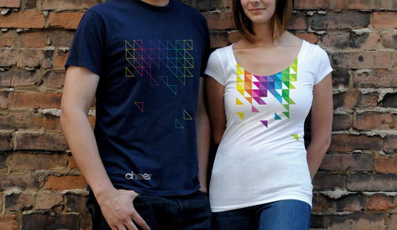
    The new design is clean and simple with a beautifully bold color palette to liven things up. The teardrop label contains a triangulated pixel pattern of the color palette, the refined Cheer logotype and a small tagline that reads “Stay Colorful”. The bright colors pop perfectly against the dark blue of the bottle, while the white space with the Cheer logotype provides just the right amount of simplicity to contrast the colors. Typically, I would disagree with the use of the lowercase “e” in the Cheer logotype, but in this case, the angled crossbars seem to add the necessary “cheerful” touch.


    Cheer logotype


    The folks at Landor provided the brains and skill to create the revamped Cheer brand, striving to connect with the untapped Gen-Y consumer. It seems smart, in my opinion, to grab hold of a younger demographic in an industry where it hasn’t necessarily been done. Gaining loyalty among college students could easily result in a lifetime connection with the Cheer brand. Landor has managed to create the brand by utilizing classic design sensibilities with a modern, bold approach to color and package design. Overall, I think they’ve married the two very well and have gained a new customer on this end. Oh yeah, did I mention this stuff smells incredibly good?


    Neil Ryan, Senior Designer


    cheer_rebrand_04_billboard

    Cheer shirts

    cheer_rebrand_05_cu721B209


  • Print is not dead (yet), and why it still matters to your brand.

    The Internet is simply one tool by which to get consumers’ attention. While the web offers an immediate way for customers to learn more about your product or service, it takes more than getting people to visit a web site to get them to open up their pocketbooks. Print, on the other hand, helps enhance your brand by offering customers a more tactile, intimate and memorable experience.


    Brochures, catalogs, or direct mailers make the intangible more real when potential customers can hold printed collateral in their hands. They keep your product or service top-of-mind when making buying decisions, or give people something to look at while waiting to speak with a representative at a tradeshow or convention. There is a reason why companies still spend millions of dollars on printed catalogs and car dealerships are stocked with hundreds of glossy brochures.


    The key to developing print collateral that will support your brand (and help drive traffic to your web site) is to evaluate your sales process to determine the various touch points you have with your customers. Some of the items that we consistently develop for our clients include the following:


    Tradeshows:

    If your company attends tradeshows on a regular basis, a large pop-up display might be a good investment. While hardware can be expensive (up to a few thousand dollars), they are easy to ship and have the capacity for interchangeable graphic panels. Bannerstands (fabric panels that work much like old-fashioned projector screens) are a less expensive option that still have the ability for customized graphics. In addition to your backdrop or display, it is important to have some sort of printed handout; this provides attendees something to remember you by, as well as give them information about your product or service should they have to wait in line for a meeting with your representative.


    Sales Kit or Leave-Behind:

    There is often a gate-keeper between your sales team and the decision maker at a prospective customer’s office. Taking a packet of information about your brand to leave with them is one way to make a favorable impression; that is, if your collateral is unique and professionally developed. A small brochure espousing the benefits (NOT features) of your product or service is one approach. A customized pocket folder containing not only a brochure, but also case study or informational insert sheets, is another effective printed piece that will help your brand get noticed.


    Direct Mailer or Follow-up pieces:

    Conventional wisdom dictates that direct mail is usually ineffective at driving traffic to a web site or increasing brand awareness. While this might be true with MASS direct mail (a shotgun approach sending unsolicited pieces of mail to thousands of people), developing a highly targeted campaign to valuable customers or prospects can be effective. The secret is to develop a list of fewer recipients that share a similar problem or interest, and then send only those prospects a series of 3-4 mailers that address those pain points and offers a solution.


    Print and interactive can work in tandem to build your brand. Printed collateral such as direct mail can help drive traffic to a unique, web landing page for your product or service, where results of different marketing campaigns and messages can be tracked. Tradeshow handouts or sales brochures may contain “call to action” statements or incentives to also drive traffic. Despite what some may say, print is most certainly not dead, and it won’t be going away anytime soon—together with the web and other interactive technologies, it is a powerful way to reach customers, increase brand loyalty, and promote purchases.


    By: Ryan Hembree, Principal, Brand & Creative Strategy

  • The SEO Sales Trap, and How to Avoid It

    Search Engine Optimization, or “SEO,” has become the new marketing buzzword. As a way to drive traffic to a web site, increase awareness of a brand, and increase consumer sales, it has risen in prominence on many companies’ “must-have” lists. Unfortunately, this powerful marketing tool is often misunderstood, and as a result, can cost companies a lot of money for questionable results at best.


    Traditional and Internet Marketing companies, many promoting the benefits of paid search and optimized web sites, have sprung up like weeds to take advantage of this lack of understanding of SEO. It seems like there is no escaping the constant barrage of emails that promote “guaranteed placement” or “top rankings on major search engines.” Of course, it doesn’t help that Google sends every registered company a $100 coupon for free AdWords advertising.


    In my opinion, some of these Internet Marketing companies are offering the equivalent of a “Yellow Pages” approach to promoting brands: remember when it was considered smart to place customized ads (costing thousands of dollars every month!) in the Yellow Pages? The rush for paid search results reminds me of this mentality, and can be epitomized by the following quote from Navin R. Johnson, Steve Martin’s memorable character in the movie “The Jerk”:

    “The new phone book’s here! The new phone book’s here! … I’m somebody now! Millions of people look at this book everyday! This is the kind of spontaneous publicity–your name in print–that makes people. I’m in print! Things are going to start happening to me now.”


    This is not to say that SEO is not worth doing. In fact, the opposite is true. There are a number of companies offering SEO/Internet marketing services that can add value to your business. However, instead of paying them thousands of dollars every month on a long-term and expensive contract, there are other ways to increase your rankings on major search engines. Companies and brands seeking to drive traffic to their web sites in order to build brand awareness or increase sales can do the following to improve search rankings organically, and without much expense.
    1. Develop a list of keywords that you wish to be found through on search engines. Be specific, as the more generic the keyword, the lower your initial rankings will be. Trying to pay for placement using generic terms will also require greater amounts of advertising dollars.
    2. Use these selected keywords throughout your site; when naming each page, link names, and for image filename and descriptions (using the “alt” tag).
    3. Provide a lot of relevant content on the web site, using keywords as much as possible; the more a certain keyword appears within your site, the higher your organic search results will be.
    4. Register your web site with all of the major search engines, not just Google. Registering your URL with Yahoo!, Bing, Lycos, Ask.com, and others will help create more connections and relevance for search results.
    5. Be patient. It might take a few months for you to notice movement in search rankings, especially if you are planning on organic search results.
    6. Start a small, limited budget campaign using AdWords, for no more than three- to six-months. When you do this, sites will start indexing you.


    There is a fallacy and misconception that Internet search is all you need. Ultimately, companies need to understand that SEO is simply one tool of many when marketing their brands. In addition to an SEO campaign, print collateral can also help drive traffic to your site and increase web traffic (which helps increase relevance and rankings). Be wary of anyone who promises you that they can guarantee a number 1 or number 2 placement in SEO. Sure, they might be able to do so for some obscure keyword or terms that no one would ever search for; or it might end up costing you more than you thought.


    By: Ryan Hembree, Principal and Creative Director

  • Animated GIFs are back?

    What is it about the repetitive motion that captivates us? We, as humans, seem to enjoy a continuous rhythm in music, a monotonous movement of the rocking chair, a captivating frame progression of an animated GIF.


    What? Animated GIF?? Are you talking about those cartoons of a smiley face winking0023that winks, or a color-shifting acid mushroom, or a cat with a machine gun?cat


    Most, by default, will react negatively to these “pioneers of web animation”. It seems like they’ve been around to annoy us ever since pre-AOL times. That is correct – they are very “oh so 90’s”, and they are back.


    Animated GIFs have been on the Web since it’s beginning. They were fairly easy to make and they brought some motion to the “prehistoric” static web pages. They represented our mood (smileys), creativity (cartoon GIFs), thoughts (photo GIFs), secret thoughts (porno-GIFs), and humor (weird guy dancing). Those 3-to-30 frame animations, at times, helped us express ourselves on the Web better than words did. They brightened our browsing experience and never failed to annoy us.


    1314185416_nobones_dance

    Animated GIFs got pushed away with the arrival of FLASH, online video and JavaScript-driven motion content. Although, there has been an interesting GIF revival lately. Some designers out there have been secretly practicing their guilty pleasures – resurrecting the animated GIFs. Carefully crafted GIFs have started to pop up all over the Web. The ones that deserve attention are actually fun, not so annoying, and even beautiful! Common thread in most of them – they are nostalgic. It isn’t just the content that makes them nostalgic – it’s the actual idea of an animated GIF, it’s historical significance to the Web. It’s like looking at some old artifact that looks strange, but you can’t look away.


    home-alone_a_GIFSoup.comWith FLASH animation being actively pushed away from the Web, there isn’t much surprise that the designers are researching other options. The “old school” GIF just happens to be one of the alternatives. My best wishes to the GIF to long live. I just want them to be crafted and placed responsibly – it does get annoying to see something like an animation loop of Macaulay Culkin.


    By Max Kunakhovich, Web Designer

  • Schlotzsky’s is the Schit

    profile image


    Recently while visiting one of our favorite sandwich shops, I noticed something a little different about the environment. My experience felt a bit more well-rounded. As I did a 360 around the shop I began to realize that there were lotz of things that were a bit different. The new furniture, new signage and a common theme on all packaging made it clear that this would not be a typical square meal.


    If the catchy title and terrible puns in the opening paragraph haven’t given it away, we are talking about the new branding effort put forth by Schlotsky’s. The new brand, or re-brand plays off of the circular shapes of the bread (or buns) that have made the Austin-based restaurant chain so successful. The ‘Lotz Better’ campaign is meant to present the visitors with a fresh, bright and contemporary feel.


    The integration of the character attributes to each of their chip and hot sauce (that sweet-sweet hot sauce) packages adds personality at every customer touch-point. The simplicity of the character attributes are what are the strengths of each element of packaging. The franchise is blatant about the consistency of the circle that adorns the new decor and products. By adding horns and a devilish goatee to the circle on their hot sauce bottle, to onion sprouts on the circle on the sour cream and onion chips, to a bold black jagged line through the circle on the cracked black pepper chips, and the line art of a charcoal grill on the BBQ chips,  it brings more interest and entertainment to the dining experience. The personality of the product is completed with the catchy saying ‘bags need chips, not shoulders.


    schlotzskys_2

    schlotzskys_1

    A true testament to the rebrand was when I witnessed a group of patrons interacting with the new packaging. They were holding the chip bags and hot sauce bottle while turning them around, viewing all that the new look had to offer. This is gold in the branding world. The longer that someone interacts with the brand and/or the more impressions you can garner generally equals better returns. Admittedly, I do not think that they were checking out the caloric values, so something must have caught their eye.


    And as promised, ‘Every Bite’ was ‘Lotz Better’…especially with the hot sauce.


    By: Josh Christie, Principal | New Business Development

  • Successful Brands Tell Stories

    Customers today have too many choices, regardless of the type of product or service they are shopping for. Often the differences between them are indistinguishable, and as a result, companies tend to compete based on price (even though they might not admit it). When the biggest difference standing between you and your competition is price, then branding must become your key differentiator.


    To be successful, all brands must tell their customers a story. No matter the company, industry, or product/service, all brands have a story to tell. As long as it connects emotionally with customers by telling them why your product or service is better, or how it will impact theirs or others’ lives, it is possible to demand higher or premium pricing. Customers will pay more for something that they believe in.


    A classic example of this principle in action is the (PRODUCT) RED initiative, started by Bono to raise money to eliminate AIDS in Africa. Consumers will pay premium prices for red-colored products from various brands, such as Apple, Nike, and Starbucks, and 50% of profits go directly to the Global Fund.

    (Product)RED campaigns


    The idea of telling a brand “story” is not new: business and marketing gurus such as Jim Collins (Good to Great) and Seth Godin (Purple Cow, All Marketers Tell Stories) have written about this concept for years. The problem is that brands have a hard time discovering what their “story” should be. Here are some ideas to help get you started:


    1. Is there something unique about the history of your brand? For example, what trials and tribulations have you overcome? Have you been in business longer than any of your competitors, and why?

    Indicia is celebrating our tenth anniversary this year, but the more compelling story is how the business partners met. Over 15 years ago they were introduced to each other by a high school art teacher and started a t-shirt company together. The resulting business lasted throughout college, and after going their separate ways they reunited four years ago.


    2. What “pain points” does your brand address? In other words, is there a particular problem that your product or service solves? Does it make peoples’ jobs or lives easier, and in what way?

    Herb Kelleher started Southwest Airlines because regional flights between Houston, San Antonio and Dallas, Texas were too expensive for most travellers. In doing so, he launched a revolutionary, low-cost, no frills airline that gave people “The Freedom to Fly.”


    3. Are there any social or environmental causes that your brand is participating in? How are you helping the local community or giving back?

    We already discussed the (PRODUCT)Red campaign to fight the spread of AIDS in Africa, but other companies are “going green” and trying to lessen their impact on the environment. Target’s story of social responsibility is evidenced by the fact they donate 5% of their profits to the communities surrounding their stores. Walmart now has recycling centers near most stores, and is trying to reduce their impact on the environment through conservation efforts.


    These are but a few examples of the types of stories brands can tell. The secret to your brand’s success is to discover what it is about the company, product or service that makes it different. The next challenge is to tell that story in a compelling way to connect and resonate with your customers. Finally, following up on the claims you make is critical. If your brand’s story is not genuine, confidence in the brand’s authenticity will falter, driving customers away and into the wallets of your competitors.


    By: Ryan Hembree, Principal | Brand and Creative Strategy, Indicia